
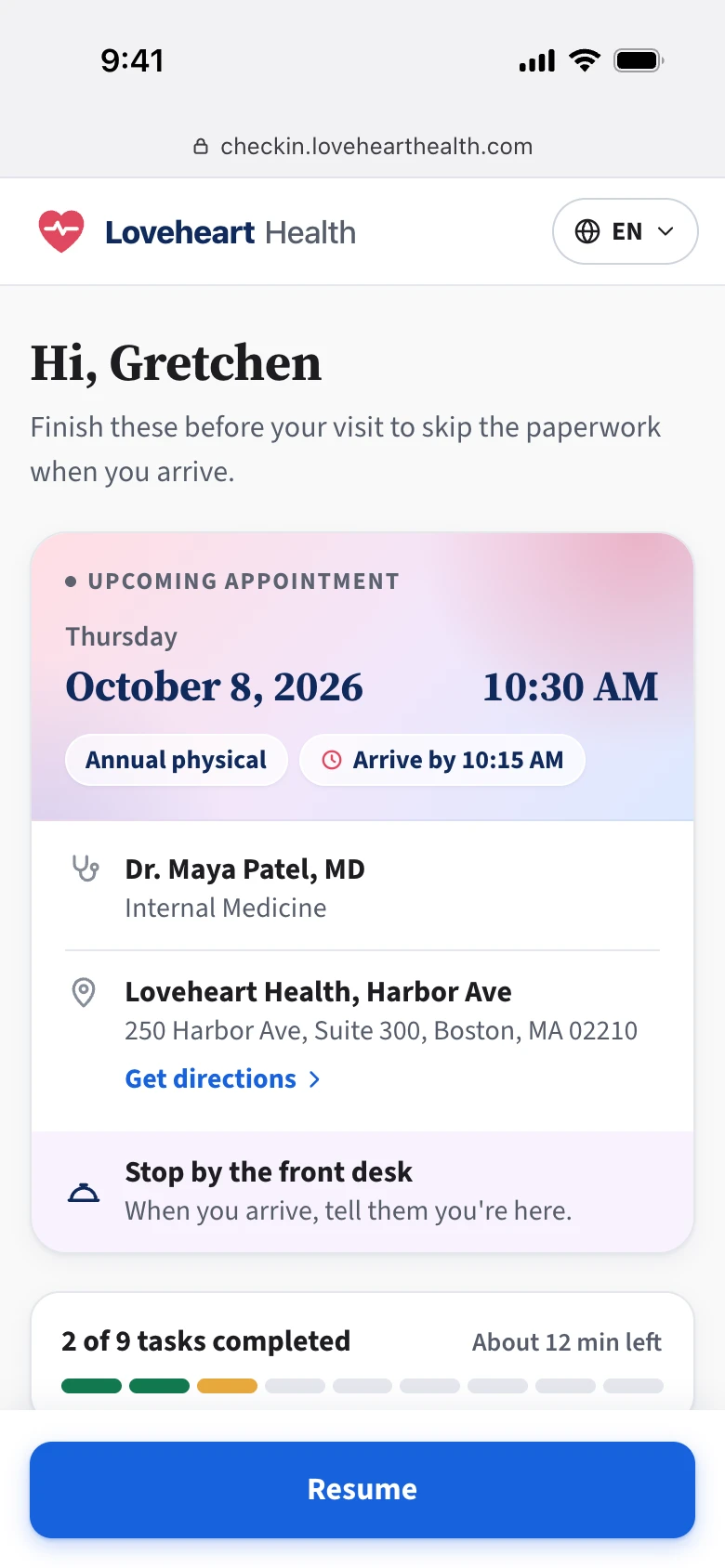
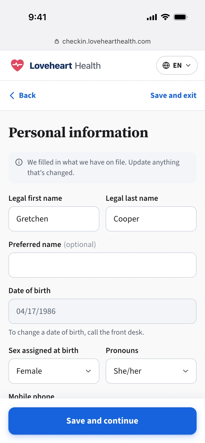
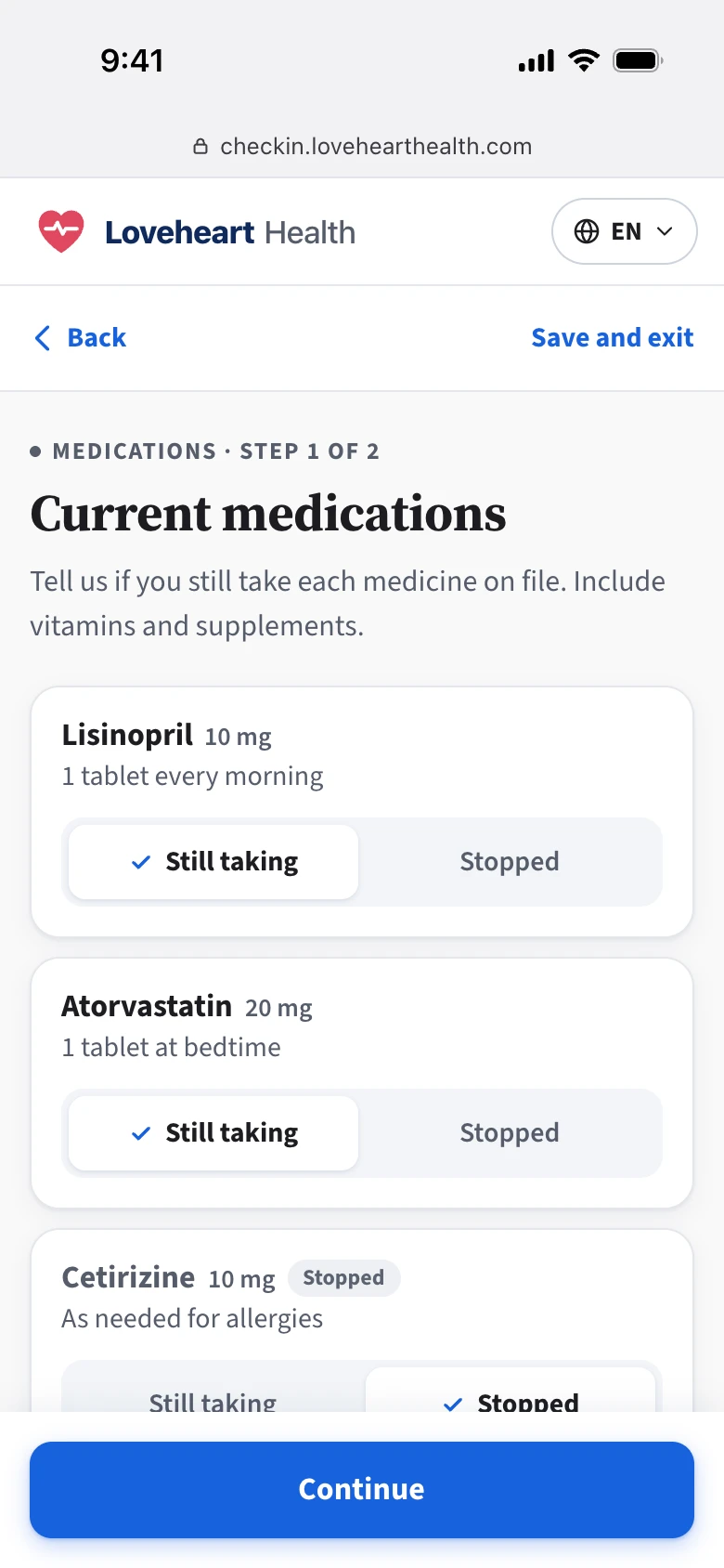
- Problem
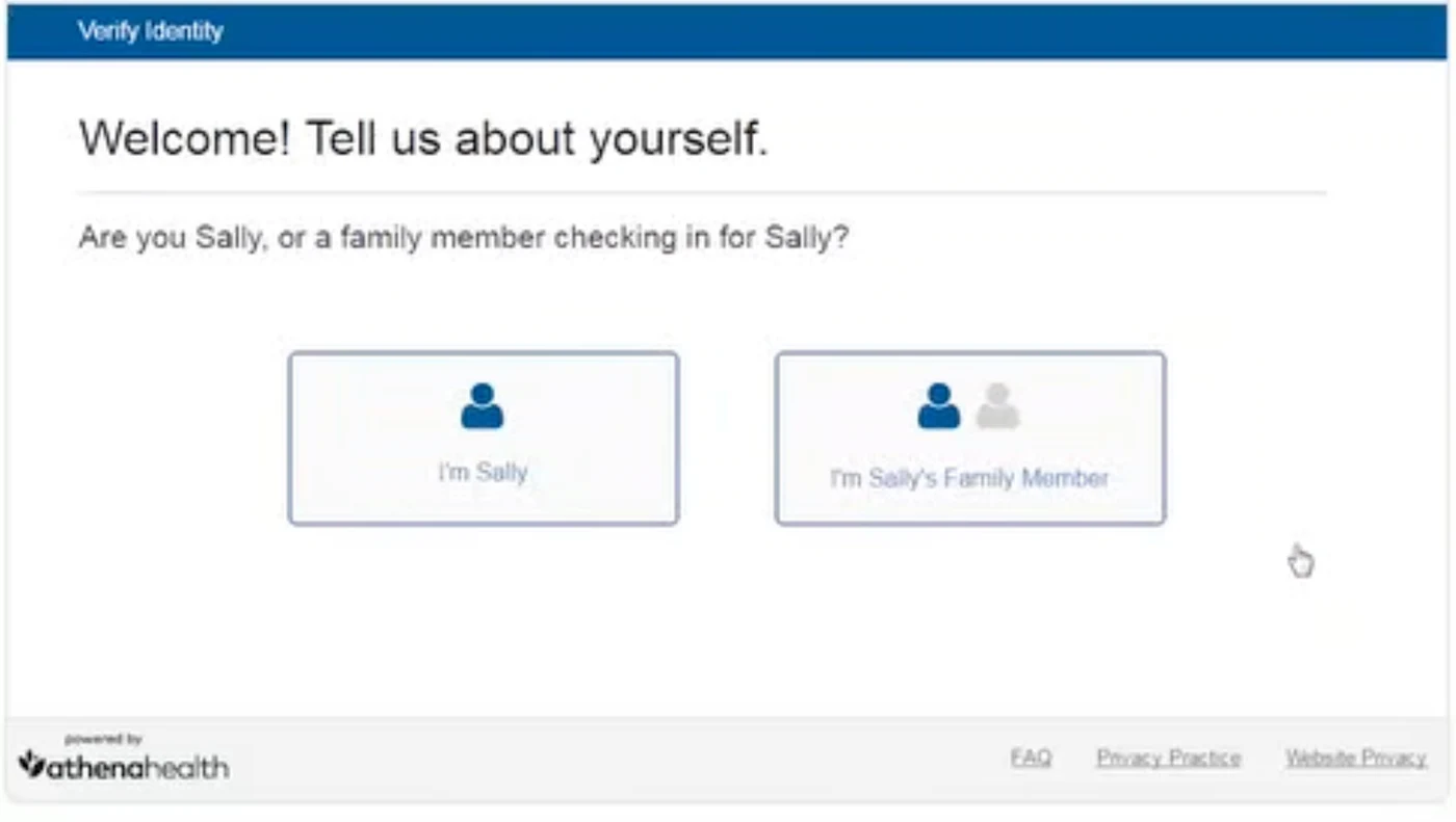
A digital self check-in should help patients get care faster and cut manual work for staff. athena had one, but it helped neither. It was desktop-only, hard for patients to use, and couldn’t be customized to fit each practice’s needs.
So patients did part of it online and finished the rest on paper at the office. Staff still had to type patients’ answers into the system by hand.
In the end, almost no practices used the legacy version. Many paid for third-party check-in tools to fill the gap instead, and closing that gap became one of clients’ loudest asks.
- My role
Senior → Lead Product Designer. I led design for the patient-facing experience, working with the PM and cross-functional teams and partnering closely with the designers who owned practice configuration and staff workflows.
- Platform
Mobile-first responsive web
- Duration
2022 to 2024
Impact
Across athenaOne
1/3+
of eligible appointments use Enhanced Self Check-In across athenaOne, a network that serves about 1 in 5 Americans
Switched back
Practices that had been paying for third-party check-in tools switched back to athenahealth’s.
One client: Virginia Urology
+56%
digital self check-ins after rollout
< 5 min
for most patients to finish
Same day
referred patients now hear back
One of the best things athenahealth has rolled out.
— Virginia UrologySource: Virginia Urology Q&A on athenahealth.com
Final design
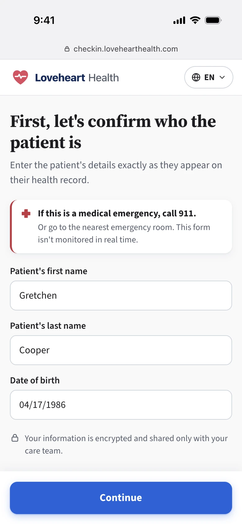
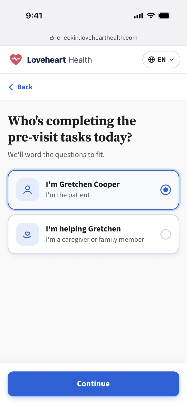
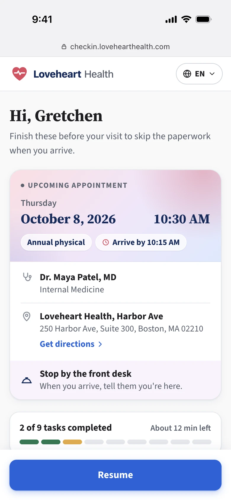
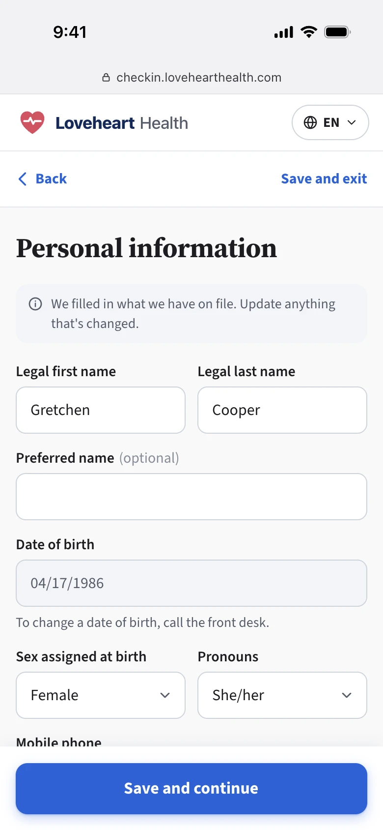
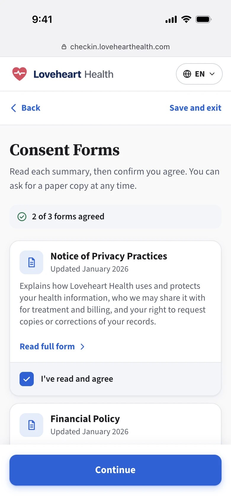
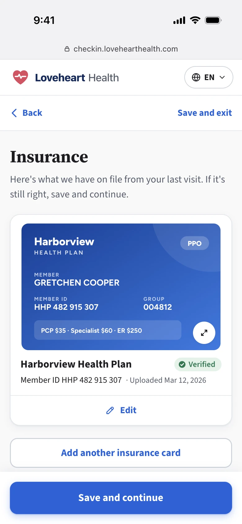
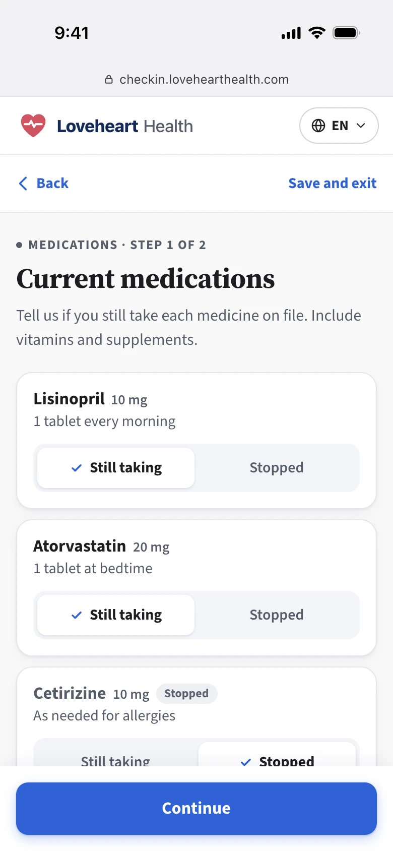
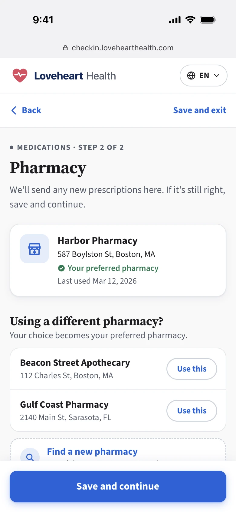
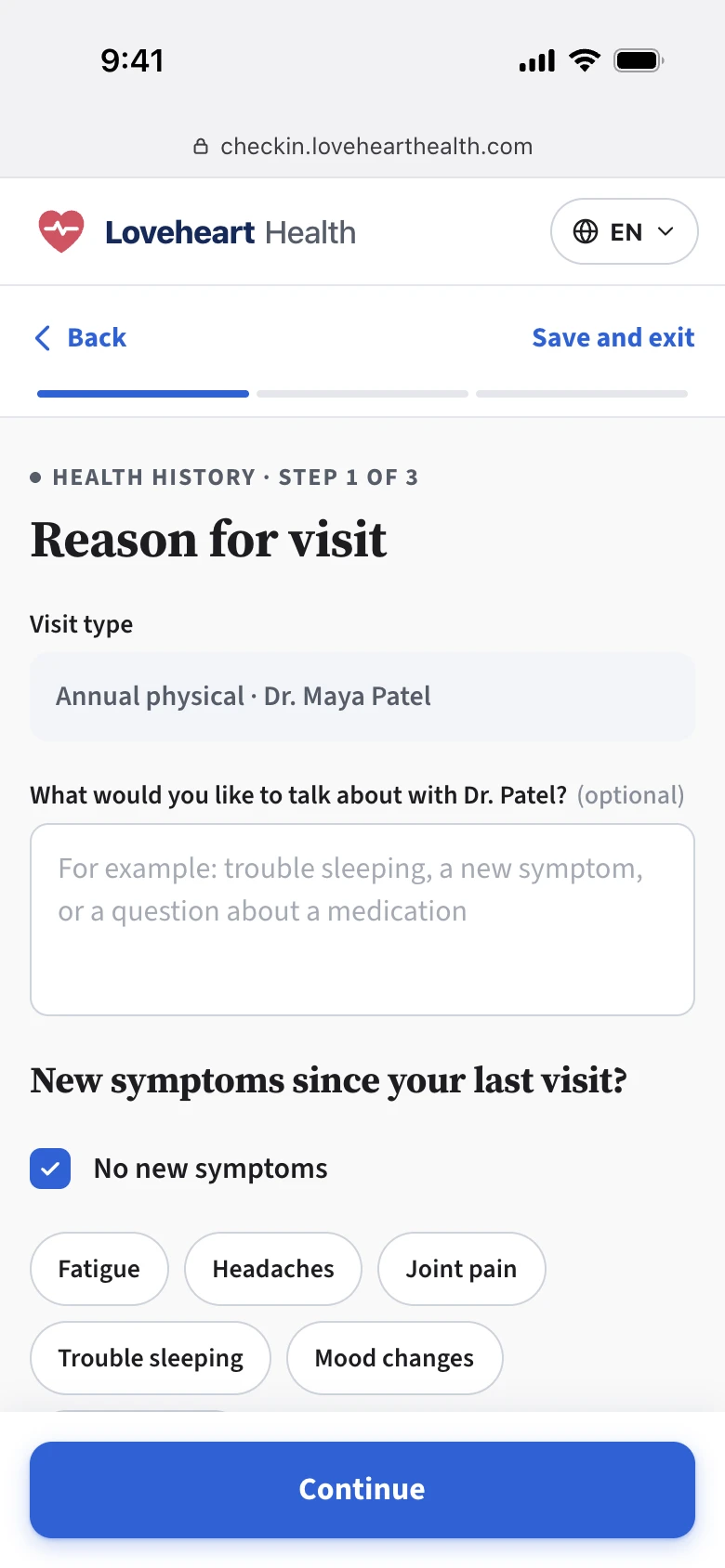
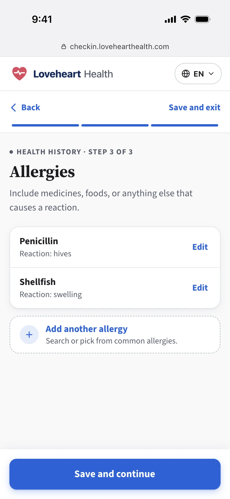
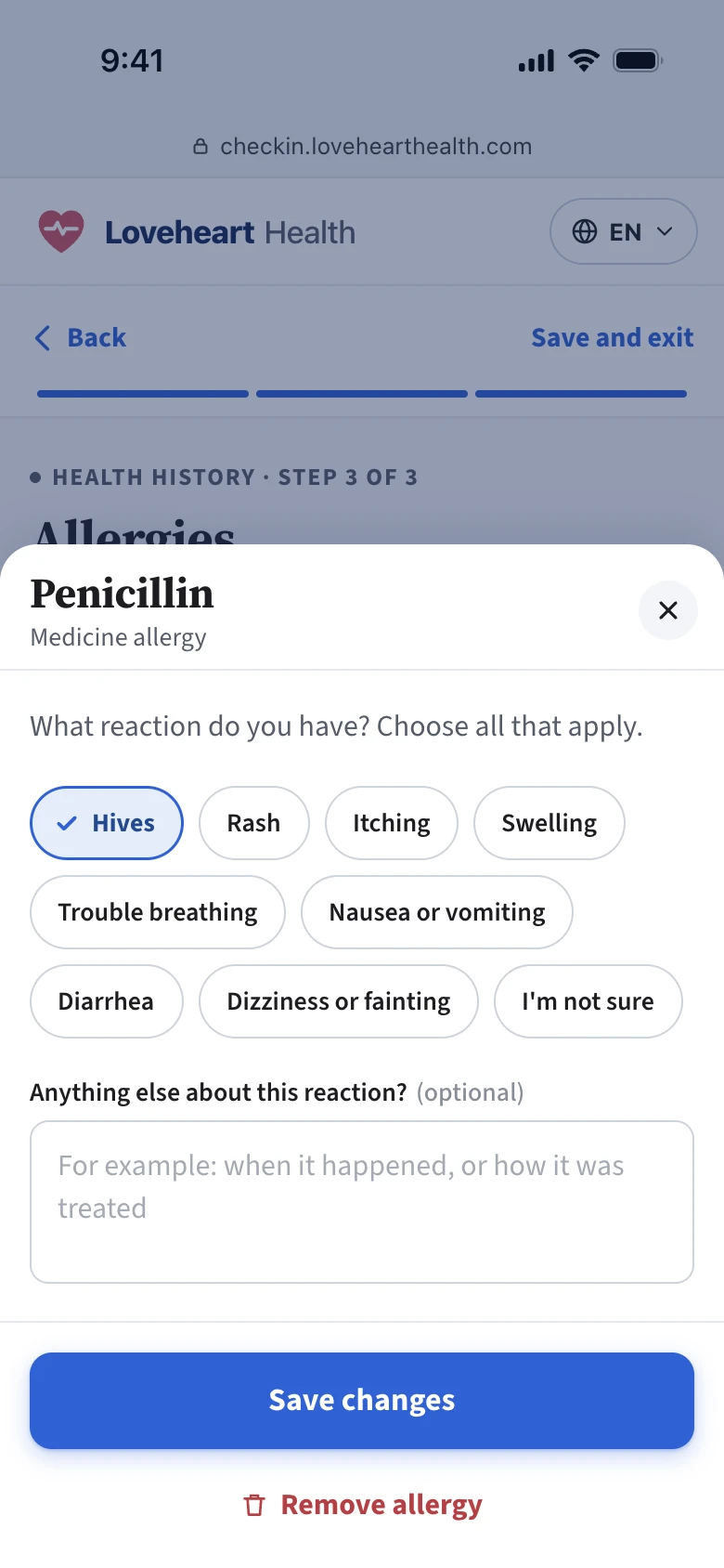
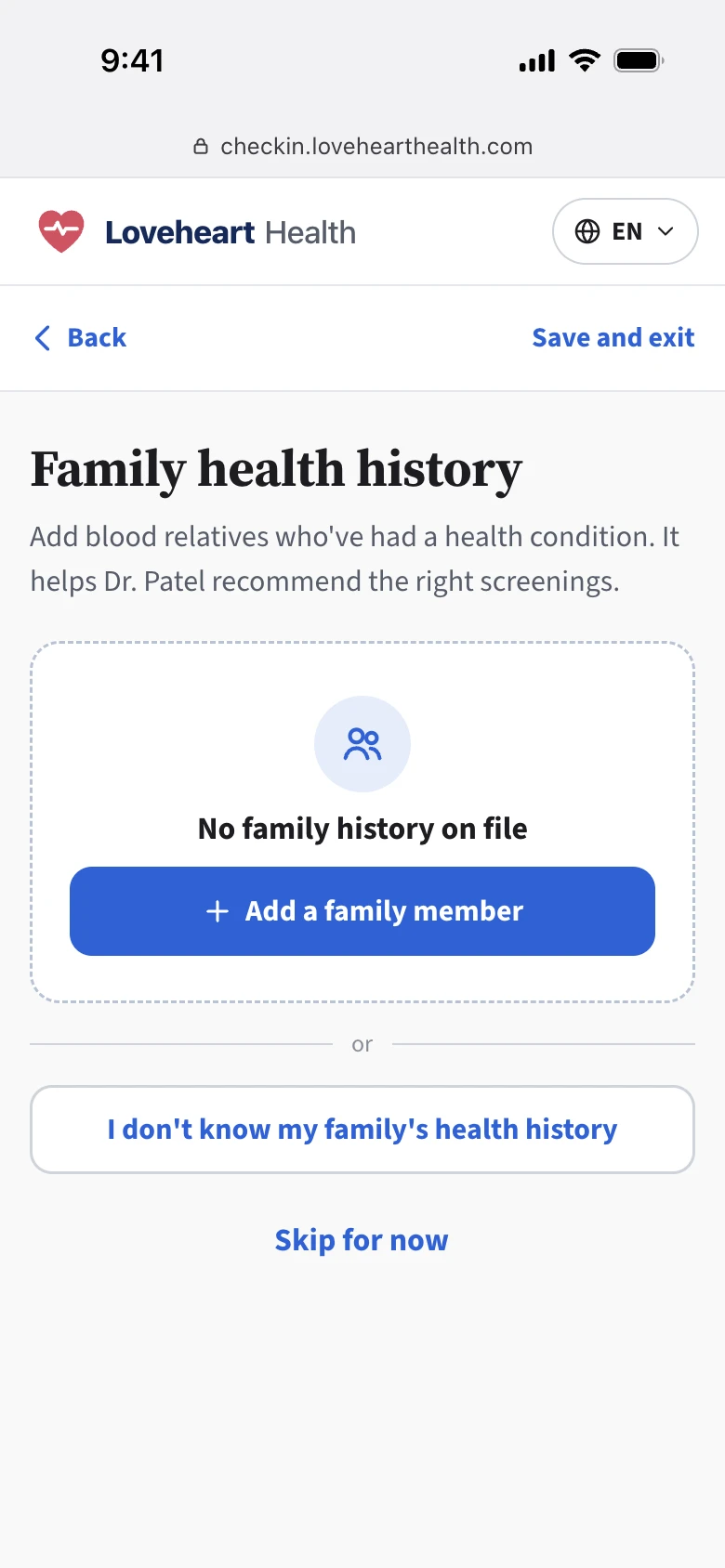
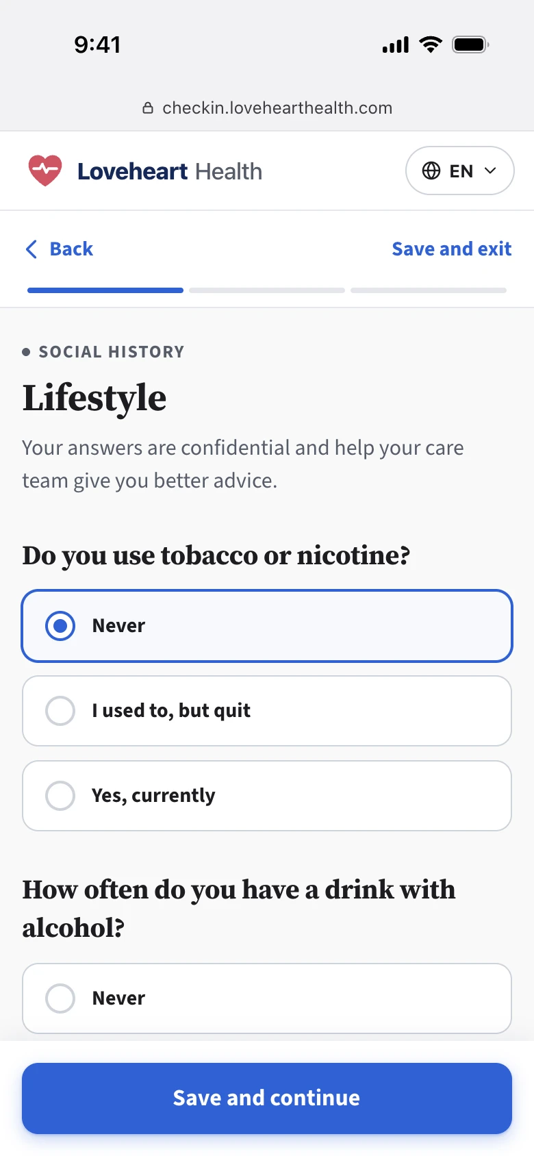
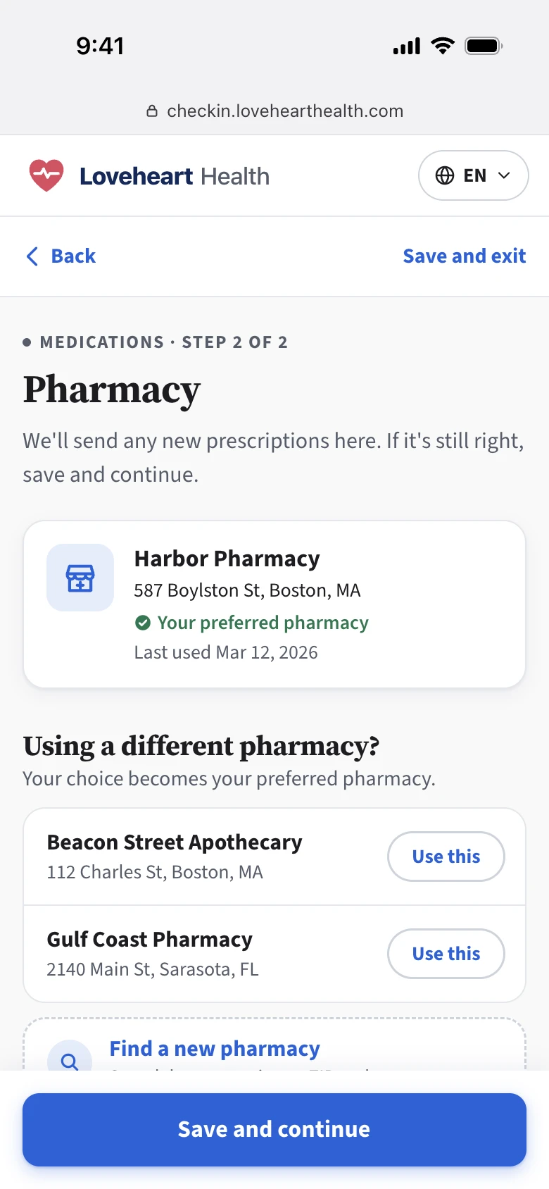
The goal
Build a modern self check-in any patient could finish digitally, whatever their age or comfort with tech. And make it flex to fit every practice, with every answer staff need landing in the right place.
Getting oriented mid-flight
When I joined, the project was already underway and the MVP had shipped.
I started by reviewing existing research. I worked with the PM to understand the roadmap and priorities, walked through the built product with engineers to learn the technical constraints, and tested the workflow myself to evaluate it.
I set two priorities for my first 3 months:
Design insurance card capture first.
Engineers were trying to build it without a design and were blocked on key product questions. Unblocking them was the most urgent work.
Fix the inconsistent UI patterns.
Without well-defined patterns, every new feature built on top would drift further.
Jumping into the urgent request: insurance card capture
01 Understand the requirements
What patients need to provide depends on what staff need. So before designing anything, I talked to two groups:
- Staff
What they needed from patients.
- Internal teams
They owned the staff-side workflows. I learned how the data would be used and what constraints we had to work within.
Key findings
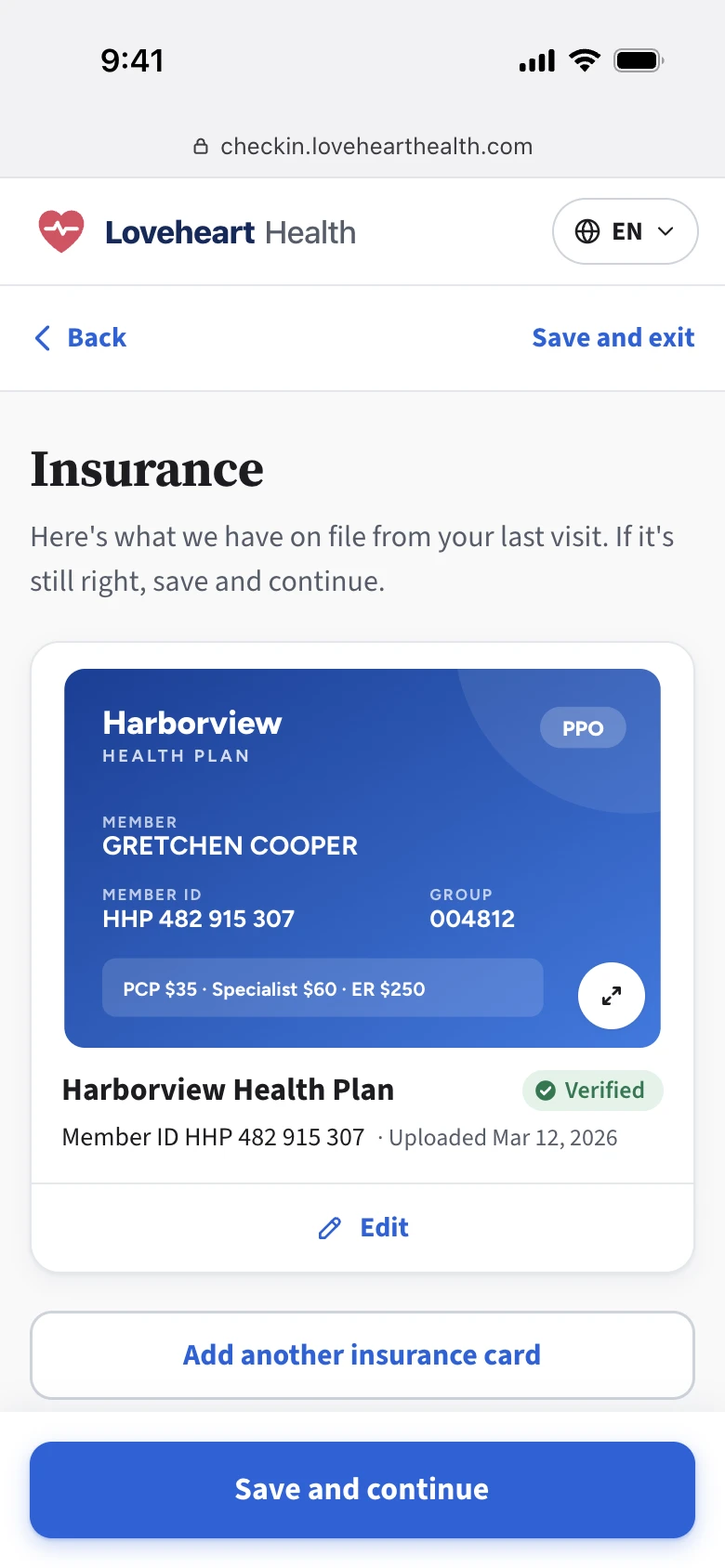
Just the photo. I talked with staff across different specialties, and they all told me the same thing: they preferred to enter the member ID themselves, since patient-typed info often had mistakes. All they needed from patients was a photo of the card.
PendingThe patient uploads a photo of the card.
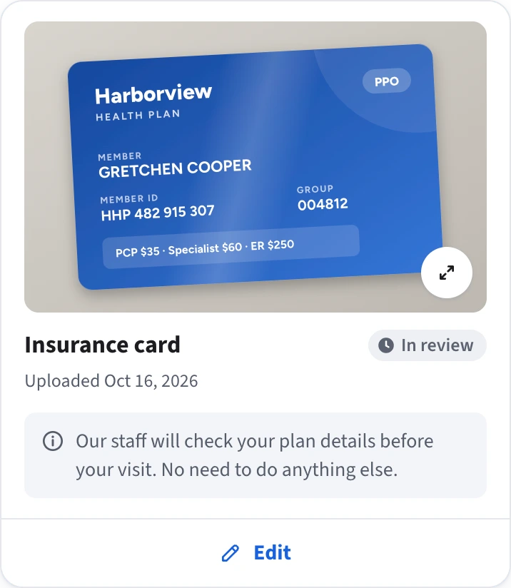
VerifiedAfter staff verify it. The verified card also shows on the patient side the next time they return, so they only confirm it’s still valid.
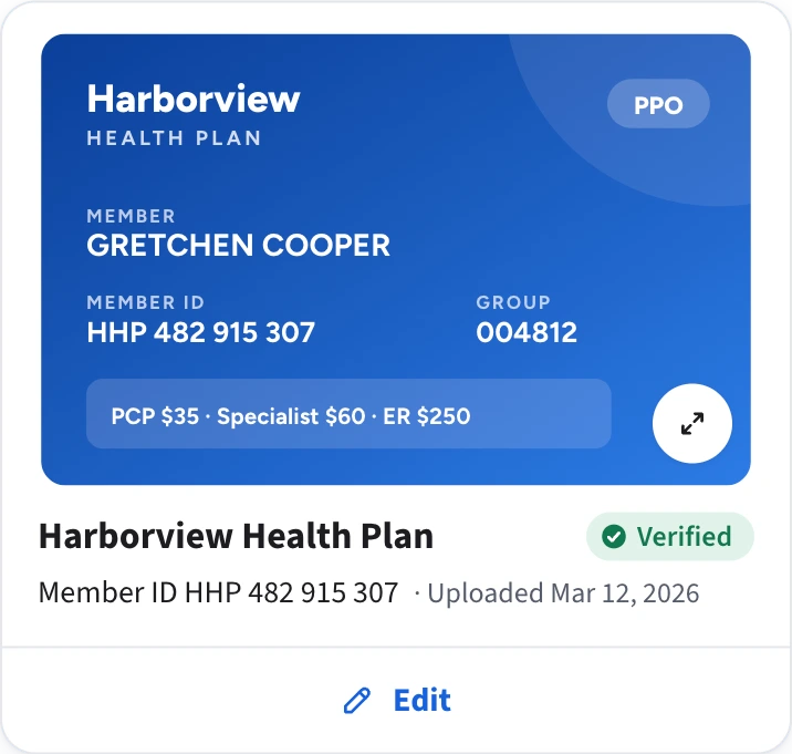
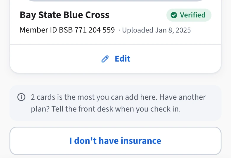
Working within a two-card limit. The team that owned insurance and eligibility told me the system could only hold two cards. Patients with more than two cards are rare, but when it happens, they need to know what to do.
One cardWith one card on file, the screen offers a button to add another.
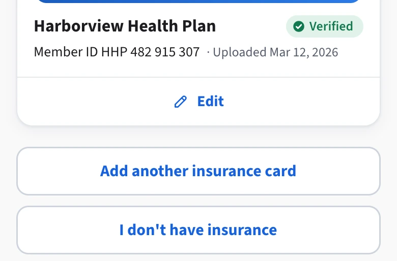
Two cardsAt the two-card limit, the button gives way to a line of text in the same spot, so patients who expect the button see what to do instead: tell the front desk.
02 After launch, the photos weren’t good enough
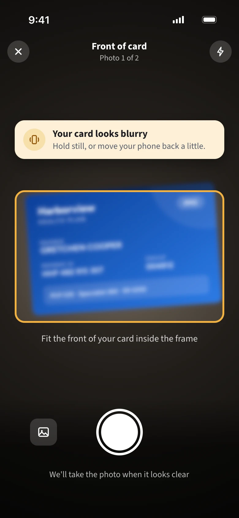
What happened. Many photos were too blurry or dark to use, especially at practices with a lot of older patients. Static instructions weren’t enough.
What we added.
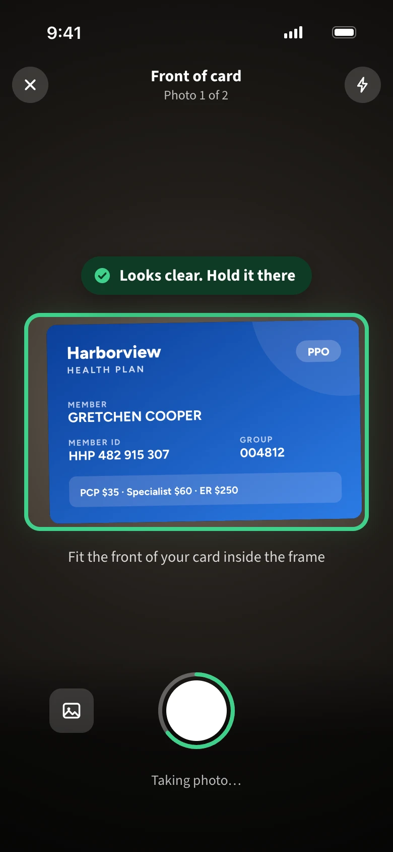
- Live guidance: “Move closer,” “Too dark,” “Hold steady.”
- A quality check that catches glare, blur, and cropped edges, and explains the fix in plain words.
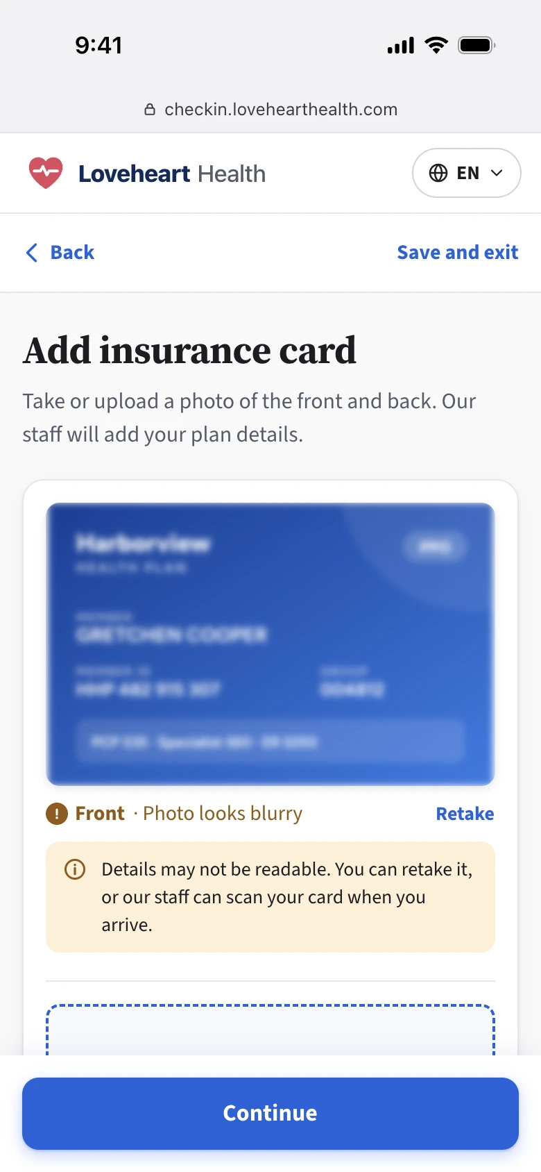
A bad photo never stops patients. If they can’t get a clear shot, they skip it and share the card in person.
Staff need the card, but no patient should get stuck on one step and give up on everything else.
BeforePatients only had static tips on the screen, and no feedback while taking the photo.
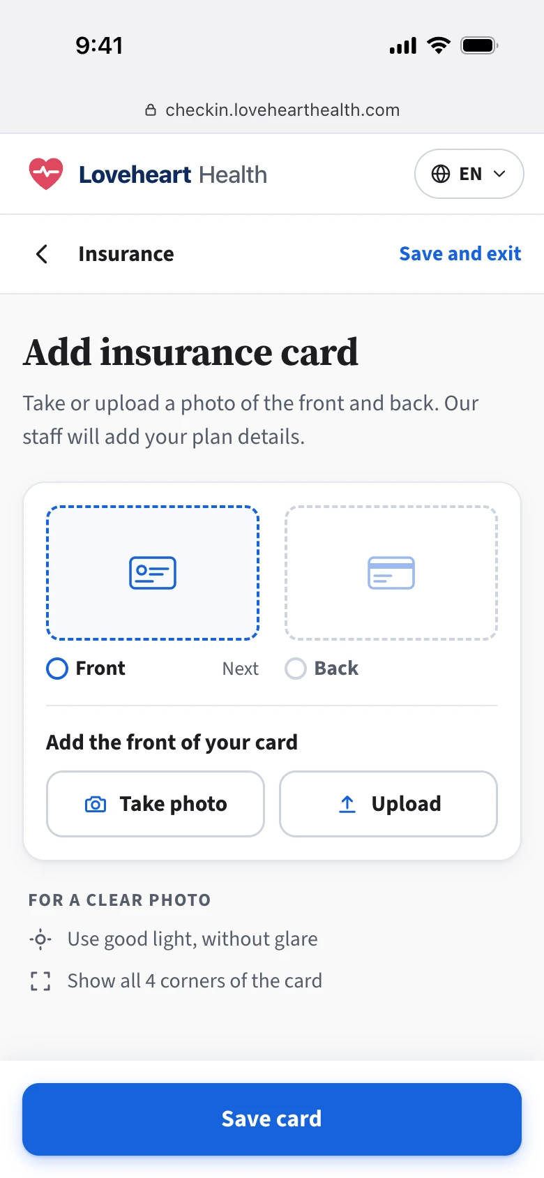
NowThe camera gives live guidance while the patient frames the card, instead of a check only after the shot.
FallbackIf the photo still isn’t clear, we warn them but don’t stop them. They can keep going and move on to the next task.
03 Result
After we added live guidance and the quality check, staff reported far fewer unusable photos. More cards arrived before the visit, giving staff time to check eligibility and call patients early if something was off.
Fixing inconsistency and building a pattern library
01 Fixing the inconsistency
When I tested the shipped workflow myself, the biggest issue was inconsistent UI patterns. For example:
- Inconsistent button labels. Submit, Save, and Continue all meant roughly the same thing. Some modal buttons said “Add [item]” or “Remove [item],” while others just said “Add” or “Remove.”
- Inconsistent components. For similar questions, some used a dropdown and others used buttons.
- Inconsistent navigation. Some Back buttons returned to the previous page, while others jumped to the start of the previous task.
I needed to fix this quickly. Inconsistent patterns made patients second-guess each step and slowed the team down, since every new screen started with a debate over which component to use. The longer we waited, the more it would spread.
So I defined each button’s label and where it takes the patient, so every step works the way they expect.
02 Building a pattern library to build fast and scale
Fixing the inconsistency showed me it was the right time to build a pattern library. With patterns and behaviors defined, the flow would stay consistent for patients and faster to build for the team.
The timing mattered for another reason. We were making the practice configuration side more robust, so every practice’s patients could see a different mix of tasks and questions. I couldn’t design for every combination, but every one had to work.
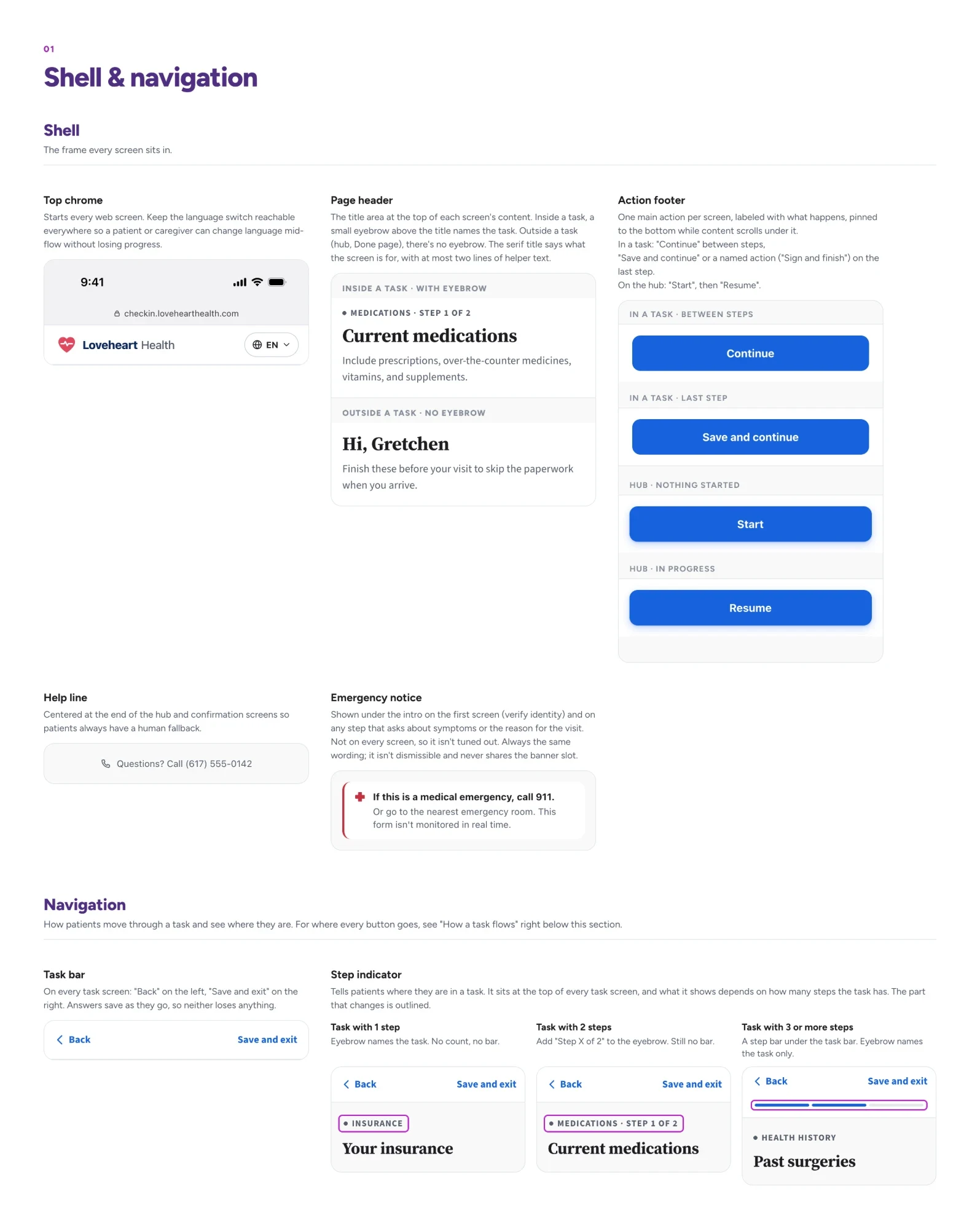
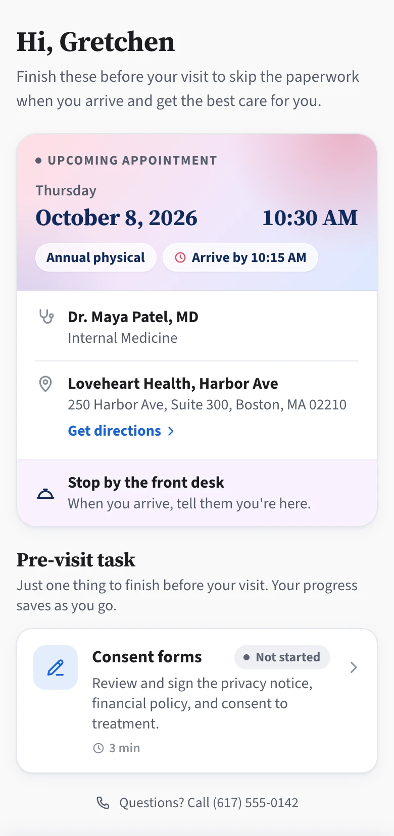
Build patterns, not screens. I built a pattern library on top of our design system: reusable patterns plus page-level templates, each designed to:
- Flex for long or short content
- Scale from one task to many
- Keep the flow working when steps were optional or skipped
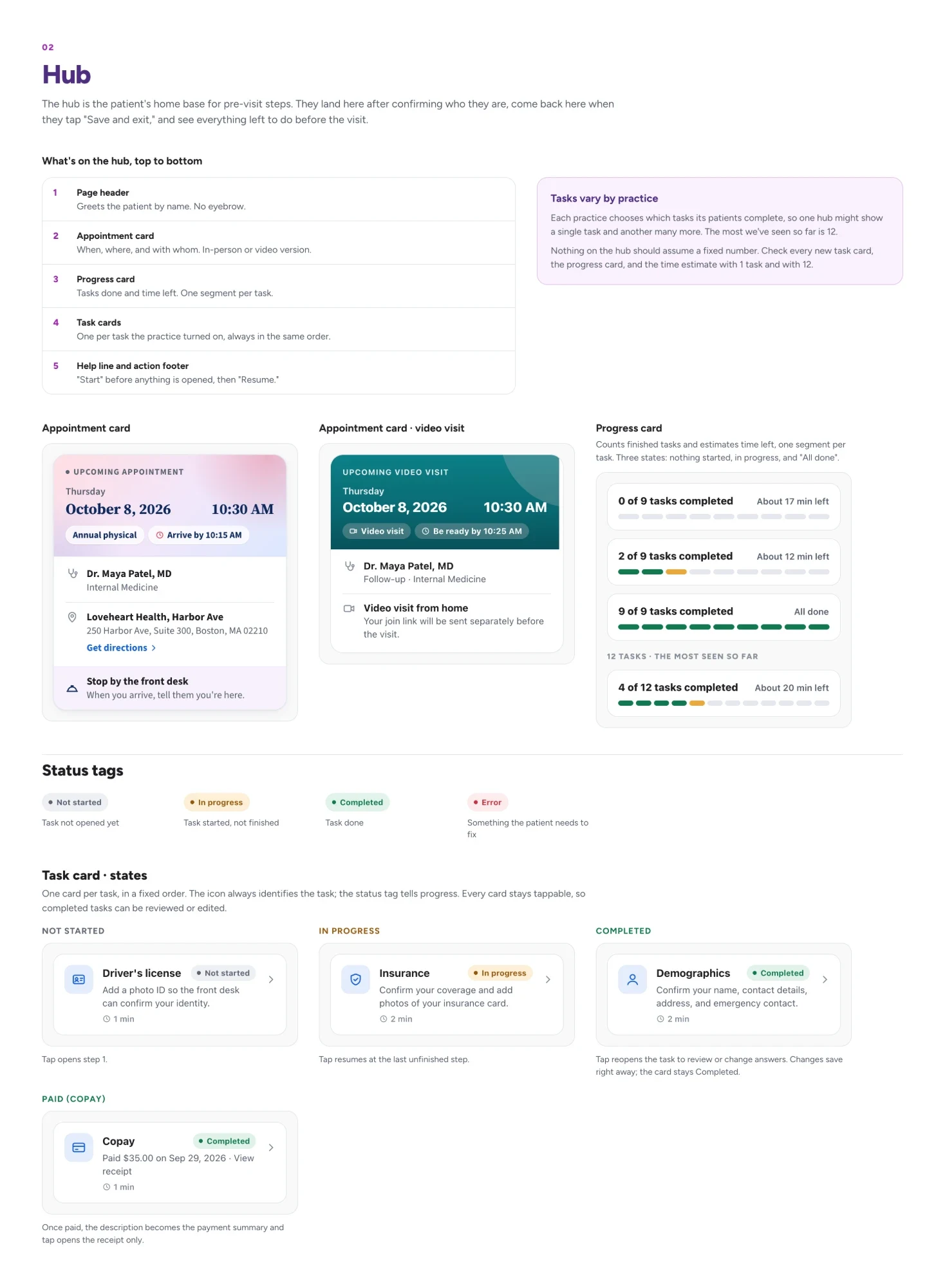
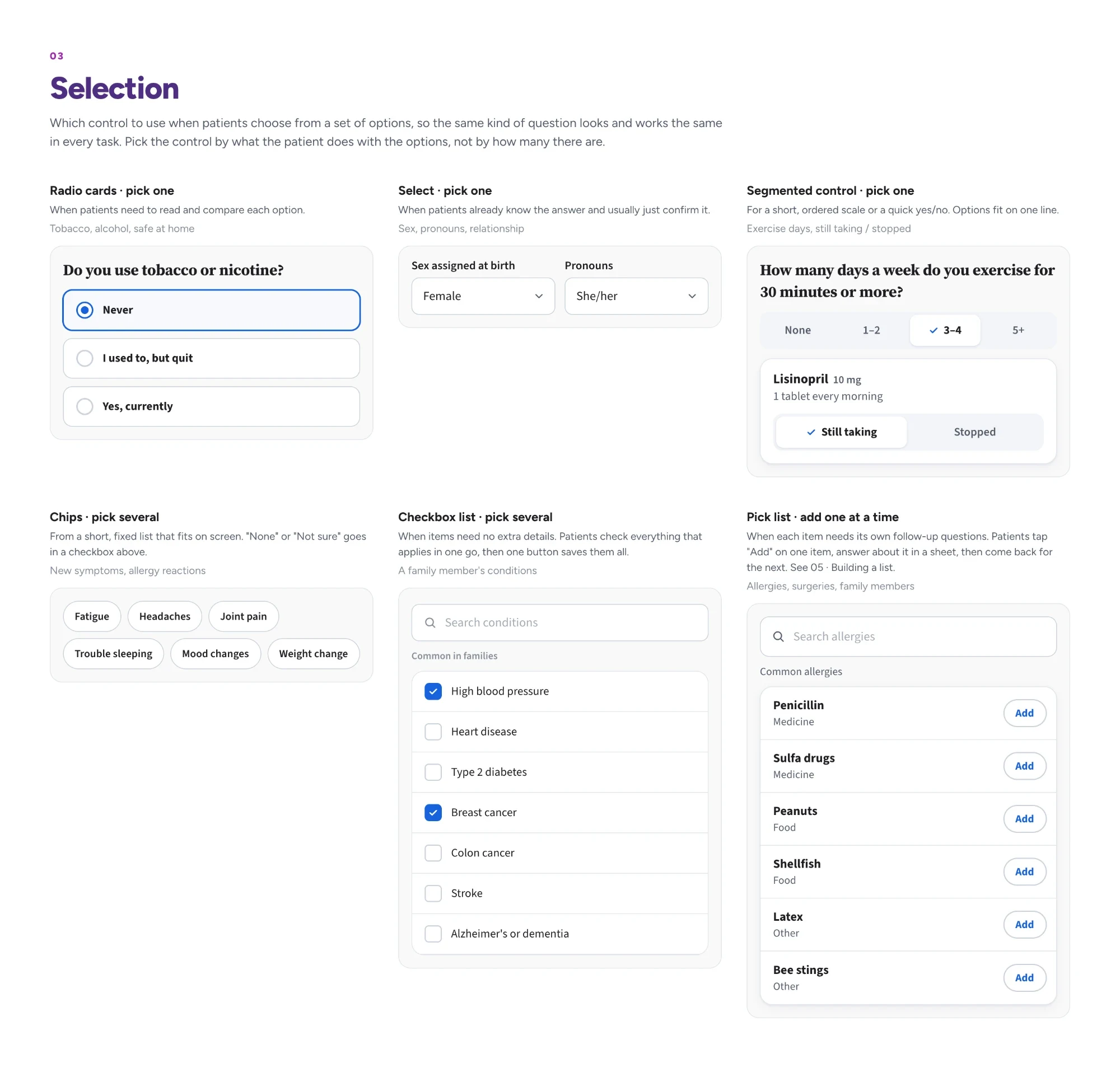
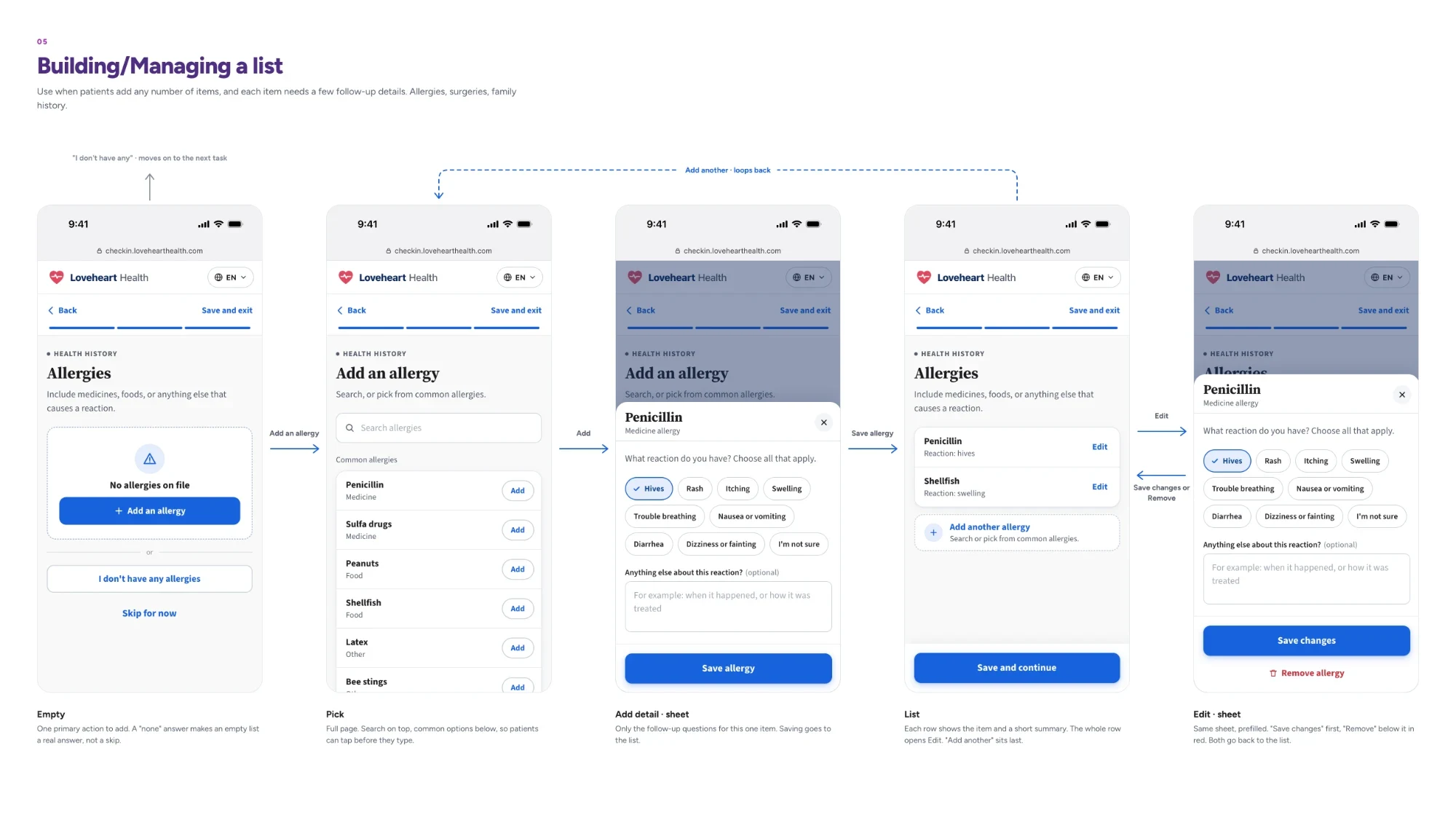
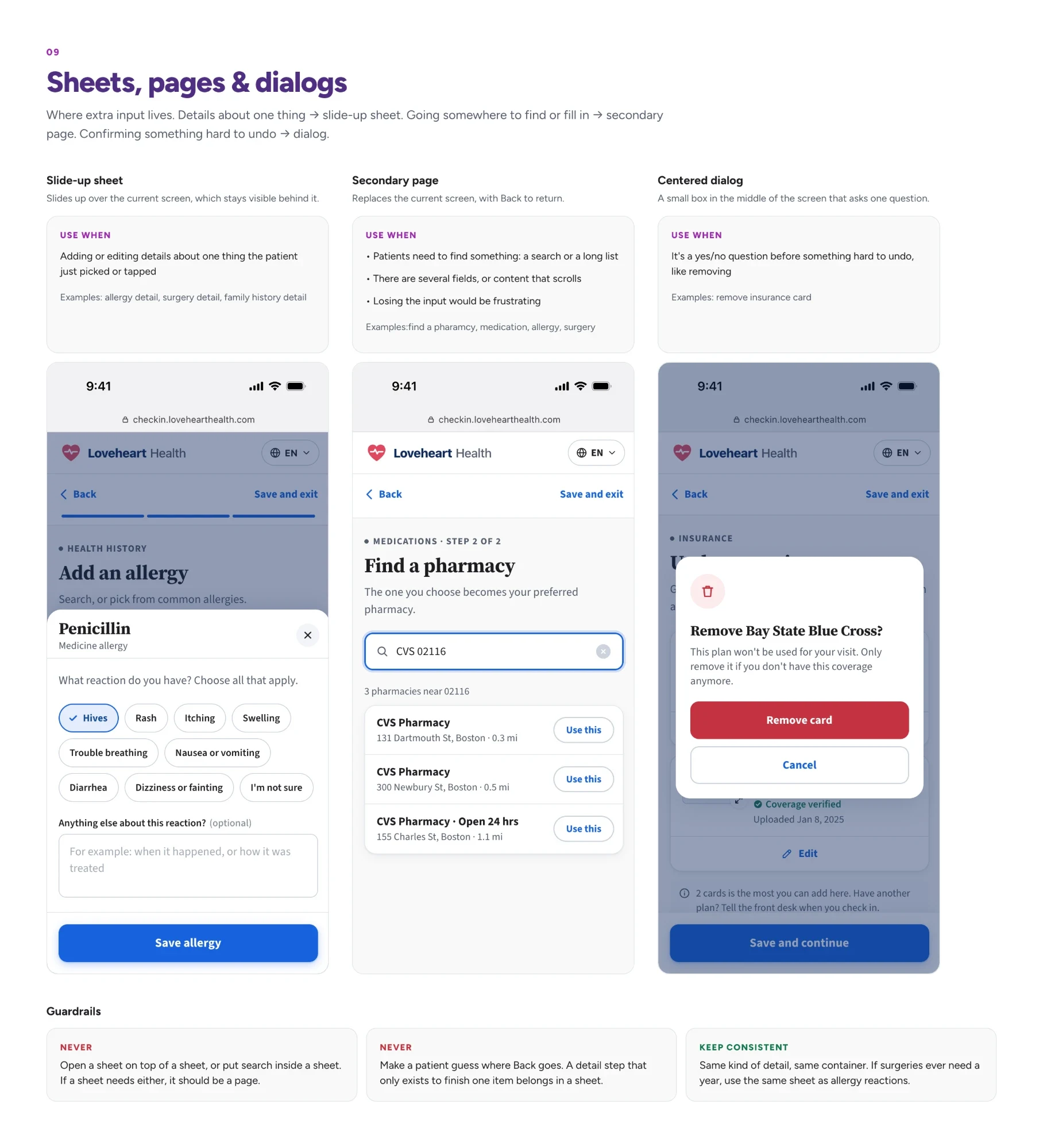
Stress-test the extremes. I checked every design against the simplest setup and the heaviest. If both held up, I could trust the setups in between.
Stress test: the practice turns on 1 task.
Stress test: the practice turns on all 9 tasks.

The result. Engineers built faster by reusing the same pieces. Adding new tasks later meant plugging into a system already built to flex.
The impact beyond the team.
- I found the same inconsistency in other patient experience workflows, so I coordinated with other designers to align the navigation buttons.
- I also shared how we built and used the pattern library with the larger design team, and other teams started doing the same.
Evolving design with feedback
From accessibility feedback to leading the design system
The audit. We worked with Testlio to evaluate the accessibility of our workflow. The results showed several components failed color contrast, and they all came from the patient experience design system.
Stepping in. At the time, the design system had no dedicated lead, so I stepped in. I explored alternative colors for those components and shared my findings and proposed colors at the design sync. Once those were fixed, I audited the rest of the components, found more with the same issue, and got those fixed too.
Becoming interim lead. From there, I naturally became the interim lead for the patient experience design system. I started helping when other teams needed a new component variant or an update to an existing one. I also set up a contribution process so any designer could fix or add to the system.
Fixing a broken component
- 1Submit a ticket
- 2Create a branch of the design system file
- 3Share at design sync with the larger patient experience design team
- 4Move the branch to review
- 5Implementation
- 6Merge the file after it ships
Adding a new variant or component
- 1Share your thoughts with the patient experience design team
- 2If approved, create a ticket
- 3Create a branch
- 4Share it with the design team
- 5Move the branch to review
- 6Implementation
- 7Merge the file after it ships
From client feedback to name change
What clients told us. After launch, clients came back with feedback we didn’t expect, and it was about the name. Patients finished the workflow at home, then walked in and sat down. Many told staff they’d already checked in online, so they assumed they were all set. Front desk staff even taped signs to the wall reminding patients that they still needed to check in at the desk.
The problem. The problem was the word “check in.” We’d been using it out of habit, but it meant different things to different people. To patients, finishing the online check-in meant they were checked in. To staff, the online part was only prep. Patients still had to tell the front desk “I’m here” when they walked in.
Renaming the experience. “Check-in” confused patients, and “intake,” the other common term, is staff language most patients don’t use. So I worked with our content strategist on alternatives, then ran a comprehension test with five patients on three names and got clients’ take too. “Pre-visit steps” set the right expectation.
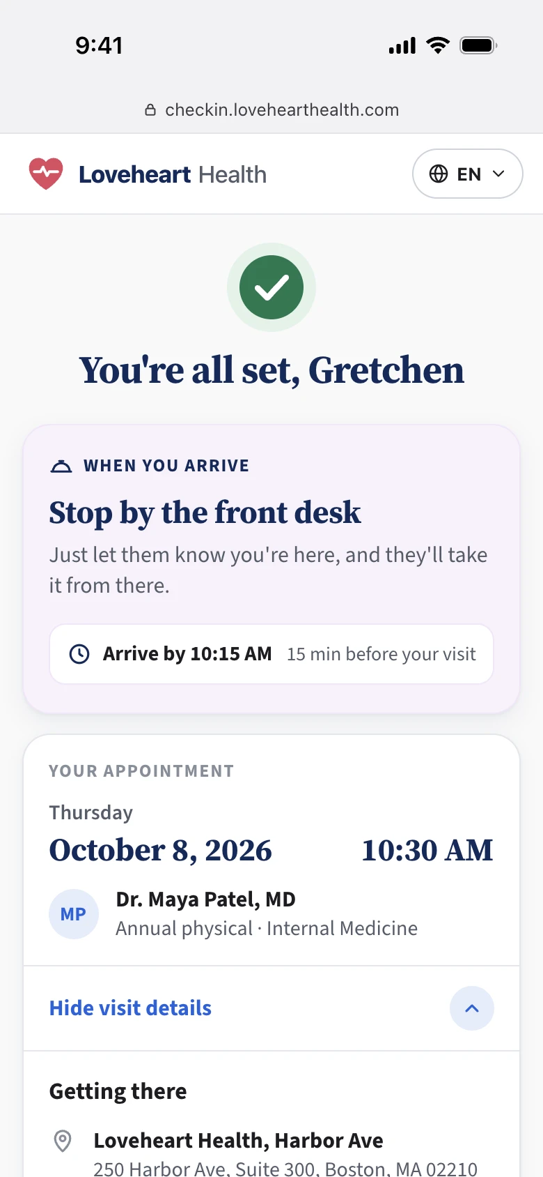
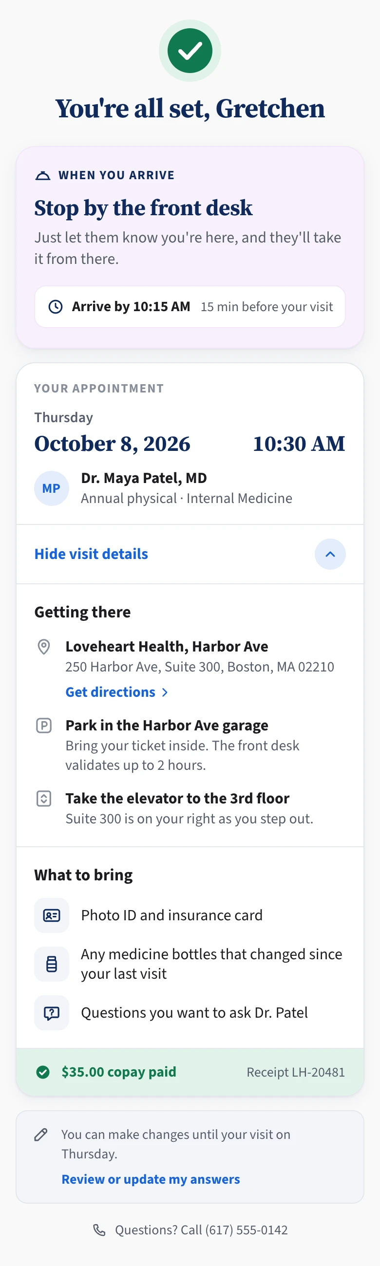
Making arrival instructions hard to miss. On the confirmation page, appointment details sat at the top. They were a helpful reminder, but not what patients needed most. The arrival instructions were further down, and patients often scrolled past them. So I moved the instructions above the appointment details, and added them to the hub page too.
BeforeThe arrival instructions sat below the appointment details, where patients scrolled past them.
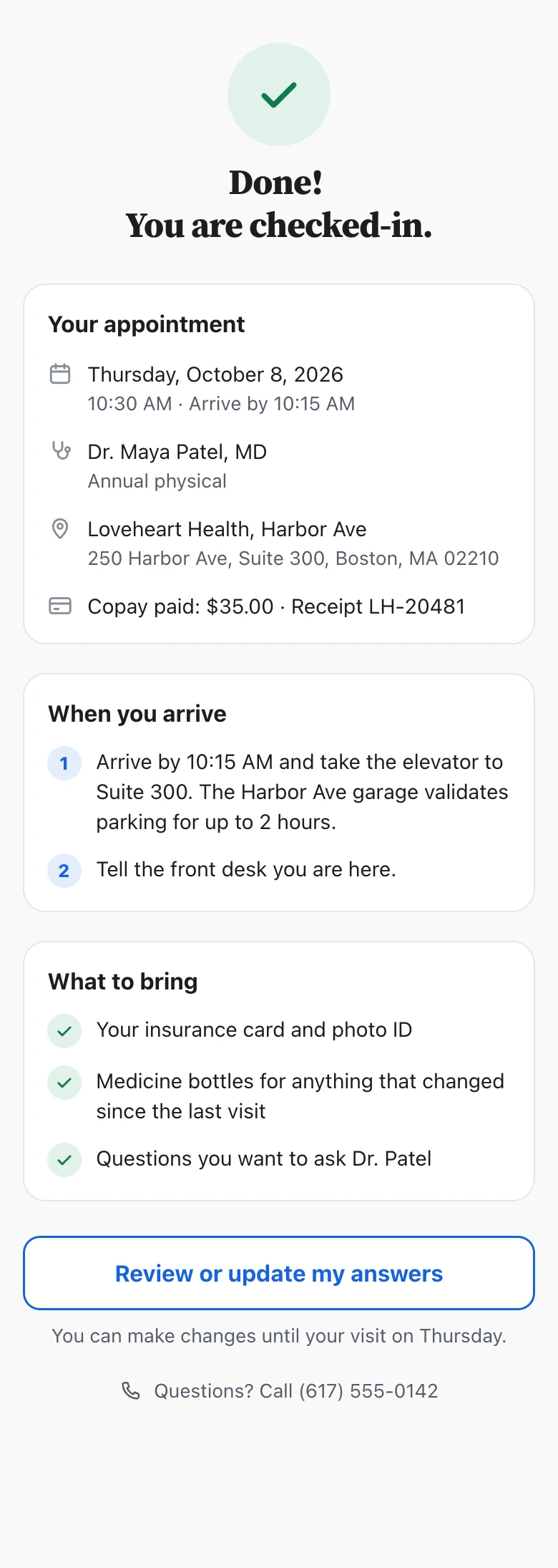
After“When you arrive” leads the page, above the appointment details, and the headline no longer says “checked-in.”
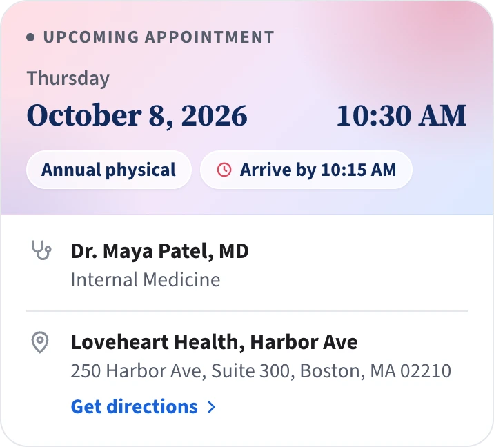
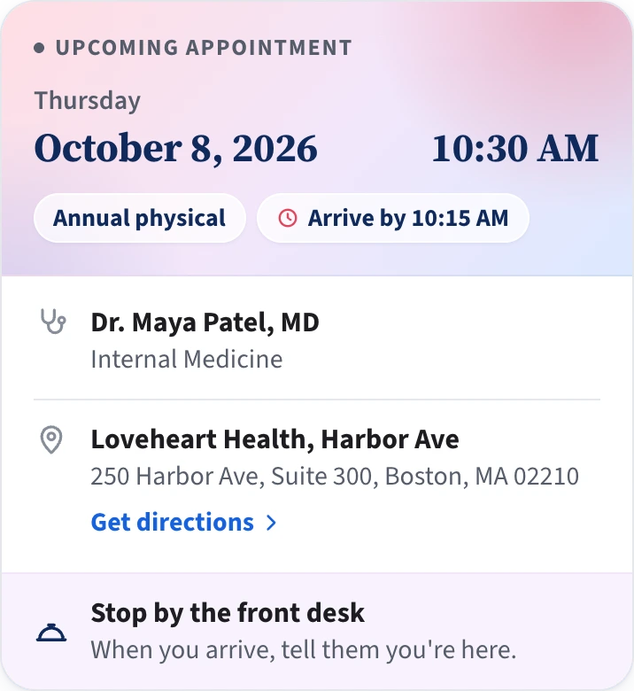
We added the reminder to the hub too. Patients see it as soon as they land there, so they can’t miss it, even if they skip past the “You’re all set” page.
The result. After the update, client reports of patients thinking they were already checked in dropped to nearly zero.
What I’m taking with me
When I joined, I thought this project was about clear steps and easy forms to help patients finish a task. That turned out to be the easier part.
Patient experience is bigger than the patient’s screens. Every form a patient fills out becomes work for someone at the practice. If staff can’t trust it, the patient ends up doing it again at the front desk. So I wasn’t only designing for patients. I was designing the handoff between patients and staff, and making sure it works on both ends.
Patients aren’t everyday users. They’re often anxious, unwell, and didn’t choose to be there. Designing for them means designing for their hardest moment.
Patients have the least capacity. Staff have the least time. Good design protects both.