Overview
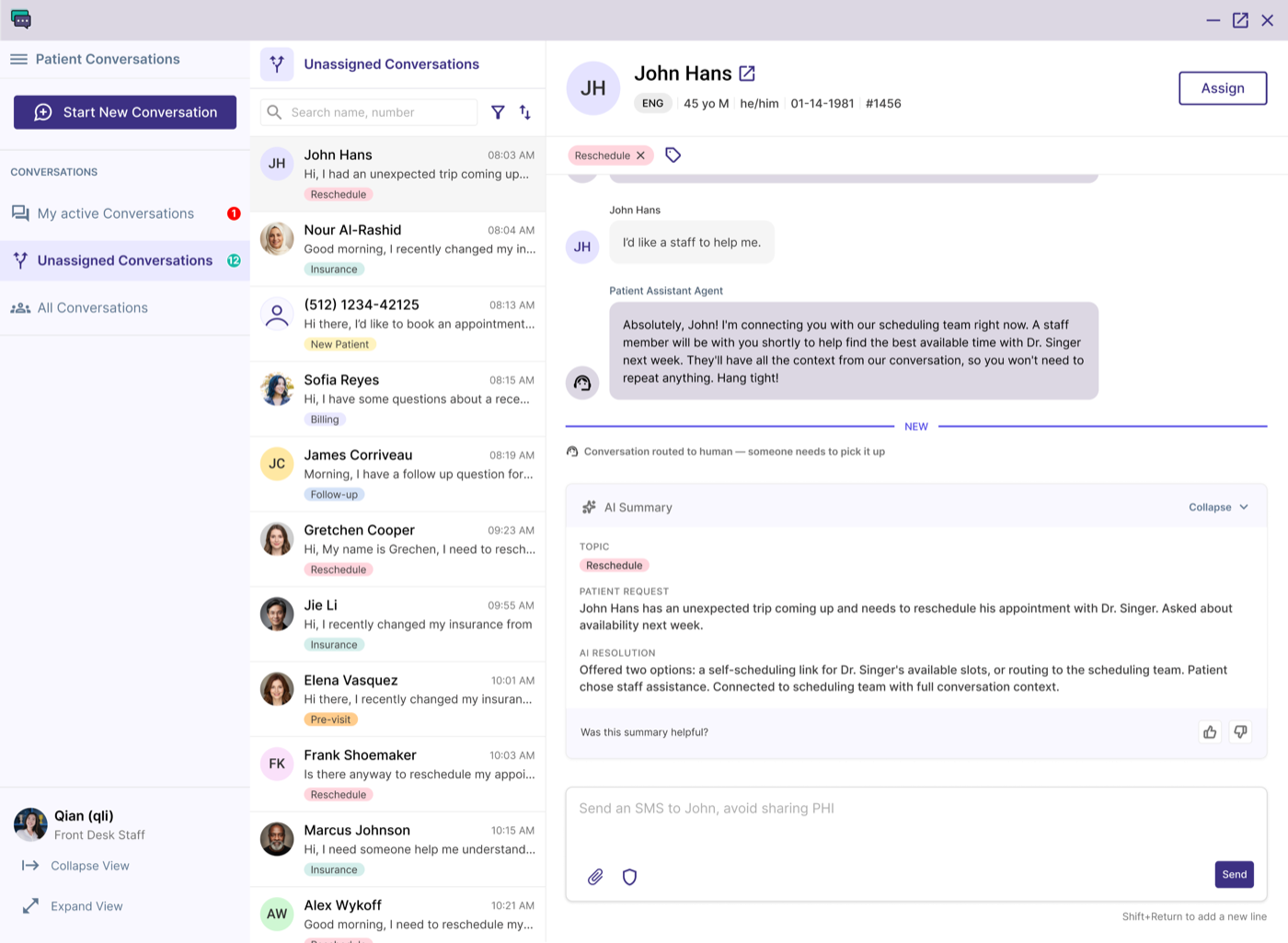
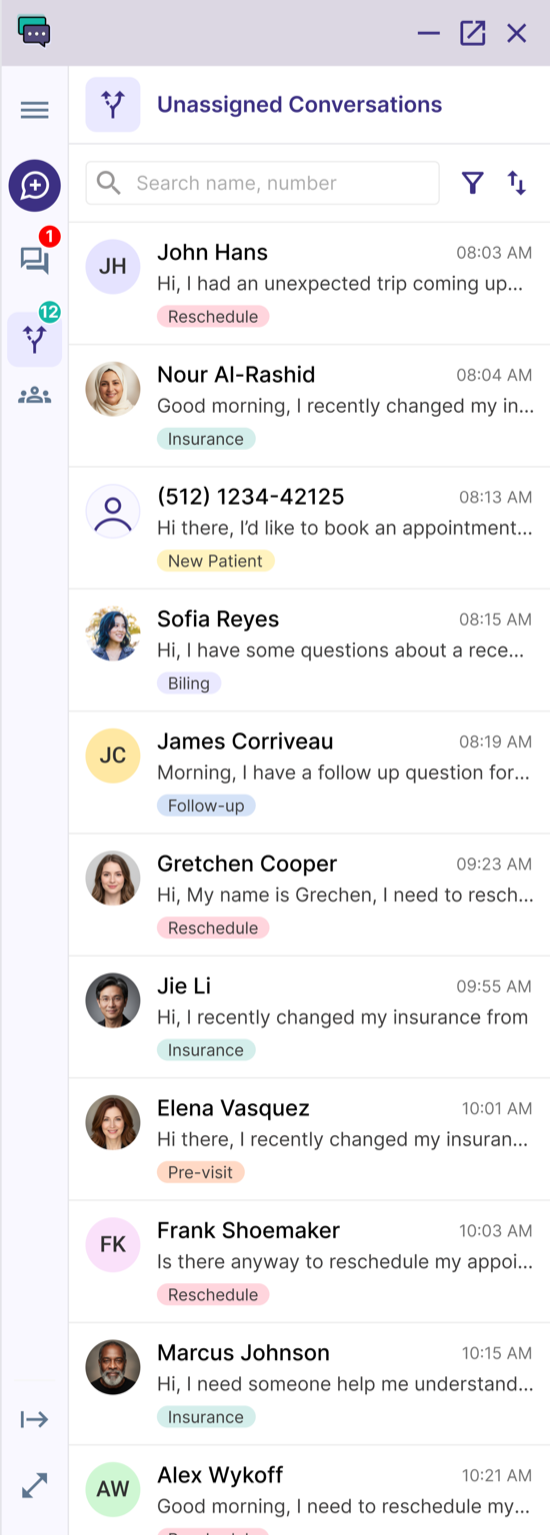
Patient Conversations is an AI-native, two-way texting and secure web chat tool built into athenaOne. It’s now in beta with 120+ practices enrolled and growing.
- 120+Practices enrolled
- BetaStatus
My role
Sole Product Designer. I led the discovery research that shaped the product vision, designed the end-to-end experience for patients and staff, and ran ongoing user interviews and monthly user-group calls to guide the product as it evolved.
Impact
I left the team before GA, so I don’t have hard usage numbers. What I do have: a product live in beta with 120+ practices, and a workaround I designed under a hard platform limit that became one of the most loved parts of the entire product.
QUOTE
“By far, this is my favorite tool I’ve used in athenaOne. It’s so easy to use.”
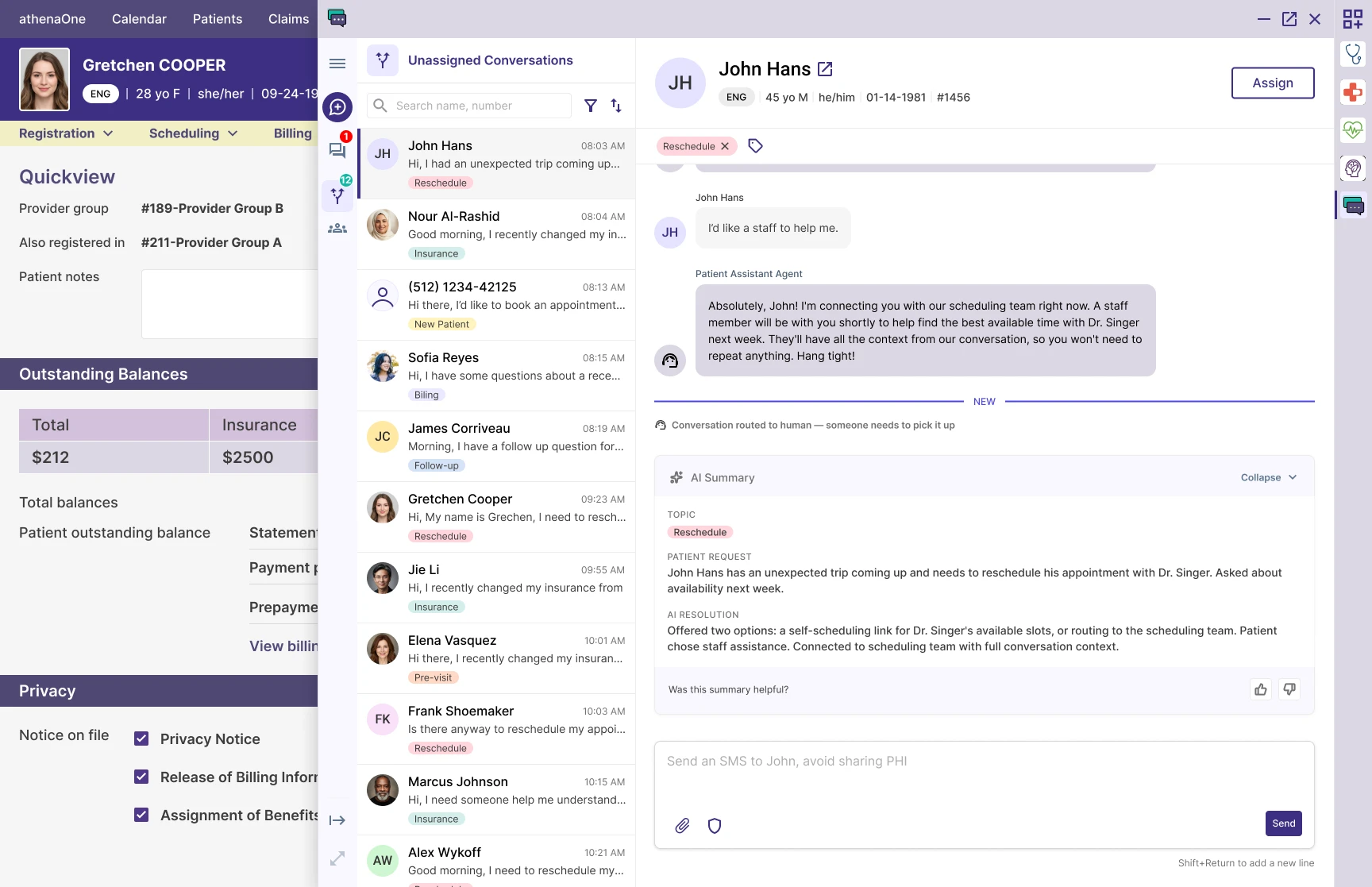
FIG. 01 — Concept work for v2
Identifying the entry points
The goal
During discovery, I needed to find where staff would naturally launch a conversation.
How I did it
Onsite visits gave me the biggest insights. I shadowed staff across different roles: front desk, billing, insurance, referrals.
Findings
- The trigger for reaching a patient changed with the job. Every role had a different moment.
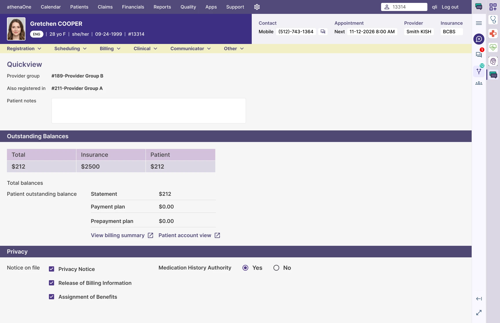
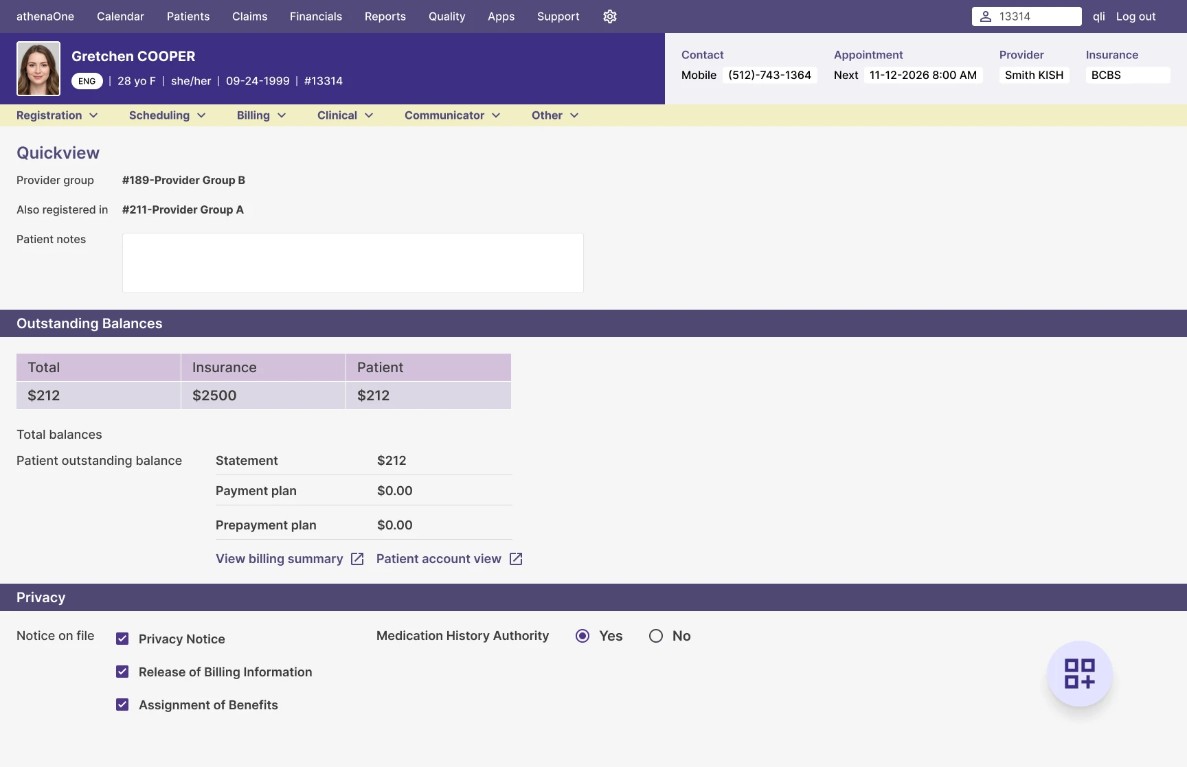
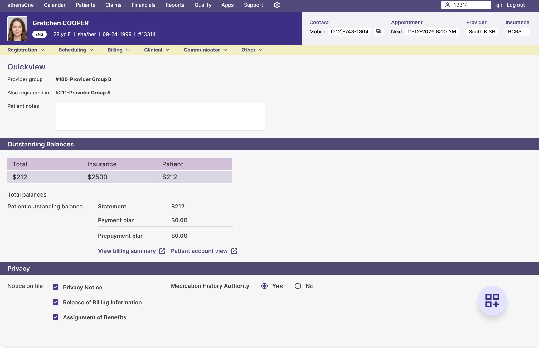
- One page came close for every job: the patient’s Quick View. Nearly every staff workflow passed through it at some point.
FIG. 02 — The patient's Quick View page.
Solution for V1
Ideally we’d cover every touch point where staff need to reach a patient. But each workflow belongs to a different team, and getting onto someone else’s roadmap takes time and facilitation we didn’t have yet. So for V1 I picked two entry points, one persistent and one contextual, enough to cover the highest-value moments now.
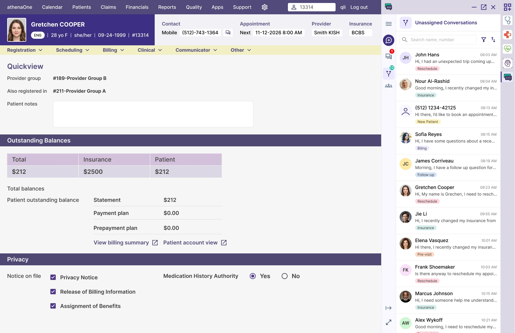
- The Embedded App Launcher, as the persistent entry point. This floating button could launch different apps from any page. I knew about it from Self Check-in. It was built for third-party marketplace apps, but internal teams could use it too, so it gave us a home with no other team’s roadmap to depend on.
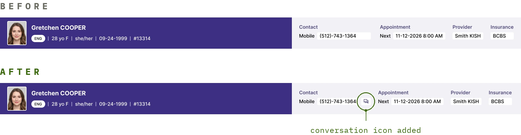
- The patient’s Quick View, as the contextual entry point. Since it cut across every workflow, staff could message a patient without leaving the page to find the app.
FIG. 03 — The contextual entry point.
The bigger picture
Many staff workflows have a moment where someone notices something a patient needs to act on: a missing form, an outdated insurance card. Embedding Patient Conversations at those moments would close the gap between noticing a problem and doing something about it. I think this becomes one of the strongest patterns in the whole product over time.
FIG. 04 — Future concept: reaching out to a patient without leaving the page
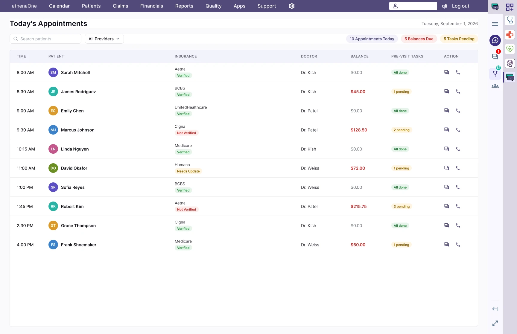
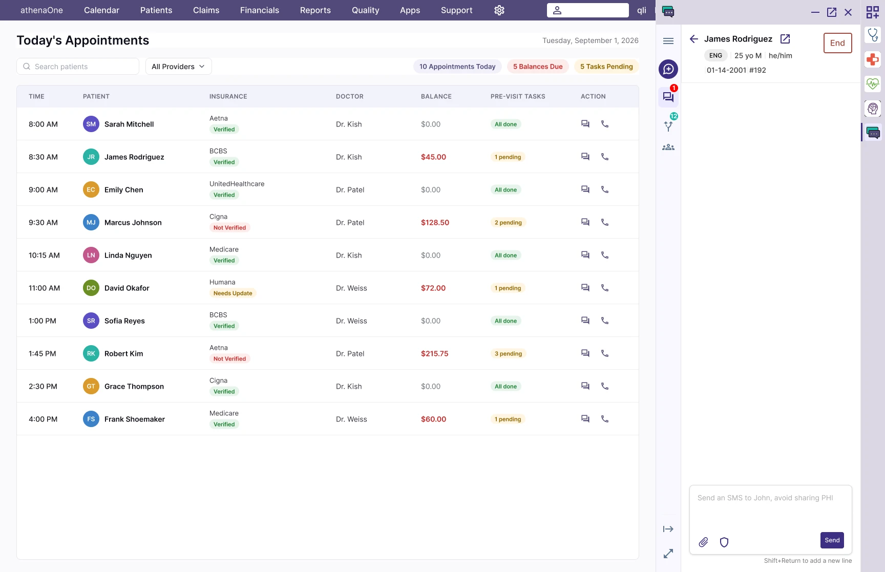
Design decisions on the patient banner
The problem
We were designing the patient banner, the strip of patient info staff see while messaging. We didn’t know which attributes actually mattered in that moment, and the answer could vary by role.
Where we started
Our PM was leaning toward adding all of them, in case we missed something.
FIG. 05 — What shipped in v1.

How I tackled it
I consulted our Patient Safety team, who could help us nail down the attributes that absolutely had to show. My recommendation: ship the bare minimum Patient Safety identified.
- Every field that turns out useless becomes noise. And users won’t tell you which fields are useless unless you ask them directly, so once the noise is in, it’s hard to clean out.
- More fields meant more dev effort for little value. These attributes pull straight from athenaOne’s Quick View, and each one carries its own variables, meaning more edge cases to build for a small item.
- If we shipped the bare minimum, we could rely on staff to tell us if something critical was missing.
- There was already a workaround: staff could check the patient’s Quick View in athenaOne, so a missing field would be inconvenient, not broken.
Result
We shipped minimal. One user asked for maternity-specific info. Nobody else flagged anything missing, even when we asked directly in interviews. Silence, in this case, was the signal.
The vendor challenge
Context
Our texting vendor was already athena’s partner for one-way reminder texts, with a working two-way platform built for other businesses. Partnering with them looked like the fastest way to ship V1, so we ran a pilot: ship two-way, practice-initiated texting, and see how it went.
The problems
- The cracks showed up in weekly demos. Their approach was to duplicate and modify existing code, so anything I hadn’t explicitly called out in the handoff (a hover state, spacing, a component’s height) simply stayed theirs. With our own engineers I never had to spell those things out. They pulled straight from our design system.
- Even small deviations took weeks. Moving a component or adjusting a height could take weeks to build if it fell outside their existing pattern. That left two options: accept their pattern as-is, or ship uneven, awkward spacing on a product clients would be paying for.
- Engineering had their own issues with the vendor too. The codebase was theirs, our team had no access to it at all, and every change went through back-and-forth with a team that didn’t share our context.
How I tackled it
- Flagged it to my manager as soon as I noticed the pattern, in our regular 1:1s, so it wasn’t a surprise later.
- Documented what we’d designed against what was actually being built, and sent the gap with a recommendation in writing to our VP of Design, so leadership had context and could back me up if we needed to pivot.
- Voted to ship anyway when the team debated pulling the plug, even if it meant onboarding just one testing client. Real usage from a real client was worth something.
FIG. 06 — What shipped with the first vendor
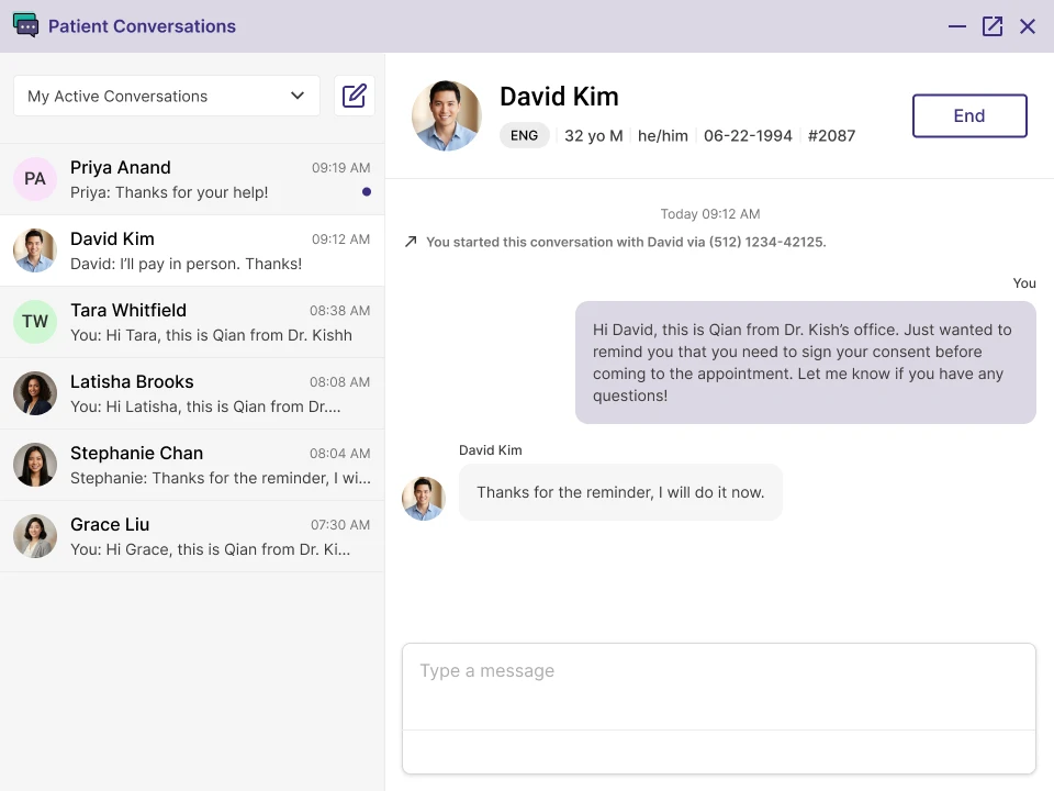
Result
The team brought a formal evaluation to senior leadership together, UX and engineering each speaking from our own side, with a plan B already in hand. We moved off the vendor and rebuilt the same workflow ourselves in a month, after some hard conversations.
The launcher constraint
Context
By the time we shipped Patient Conversations to our first client through the vendor pilot, we knew the embedded app framework had no badge notification support for docked apps. We hadn’t known that when we picked it as our entry point, and it wasn’t the framework’s fault either. It simply wasn’t built with a chat app in mind, and nobody had anticipated the gap until we ran into it.
The problem
Staff would dock Patient Conversations like any other app, come back later, and have no idea a new message was waiting. Some started dragging it to a second monitor just to keep an eye on it. One more window among ten others they had to remember to check.
How I tackled it
Fixing the framework meant waiting on the roadmap of the team that owned the Embedded App Launcher. Once we moved off the vendor and began rebuilding in-house, this was one of the first problems I started exploring on my own: was there anything intermediate we could do while waiting for the real fix?
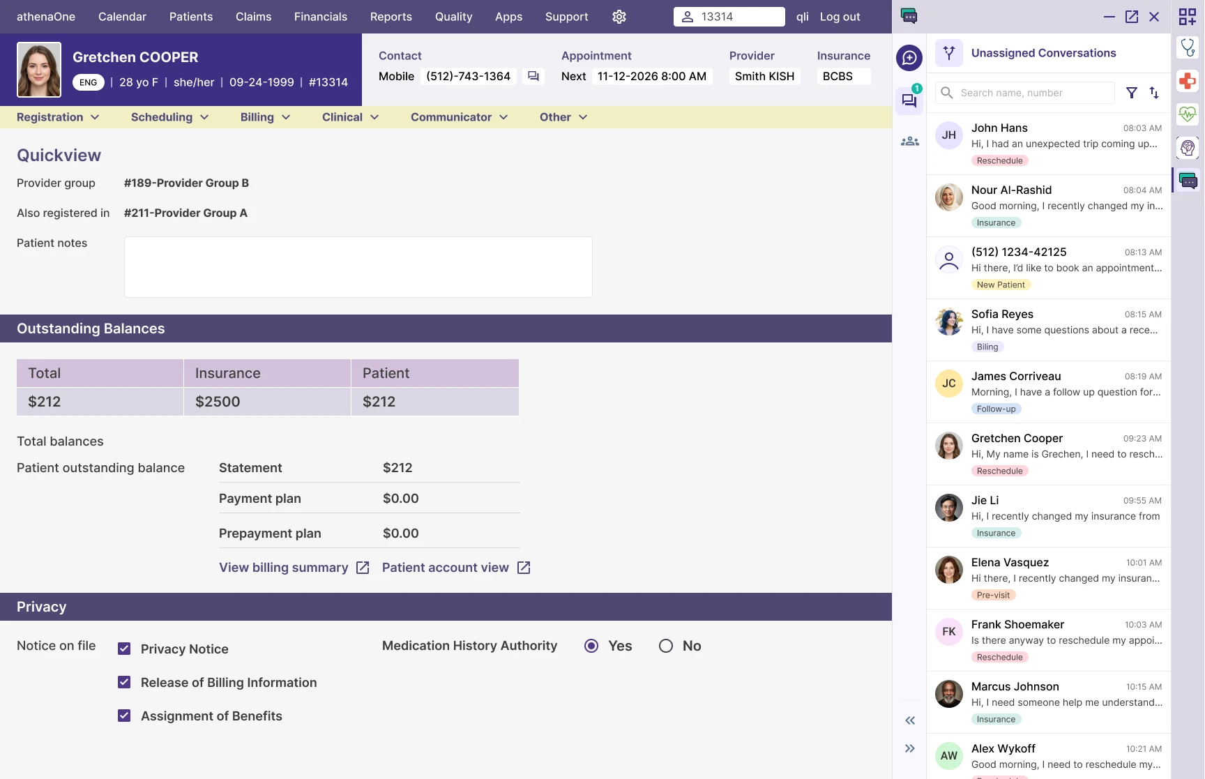
Around the same time, that team mentioned they were building a new way to launch apps with variable view sizes. Within a certain range, the panel could sit side by side with the main content instead of covering it.
The aha moment came as soon as I saw the side-by-side view. If we could keep the window open alongside the rest of the screen without being disruptive, we could surface our own badge for new messages instead of waiting on native support. Not only would this let us skip waiting on that team, it turned out to be a better experience outright.
When I was onsite with our first testing client, I noticed staff constantly minimizing and reopening the app just to check a schedule or a billing statement while messaging a patient. That confirmed it.
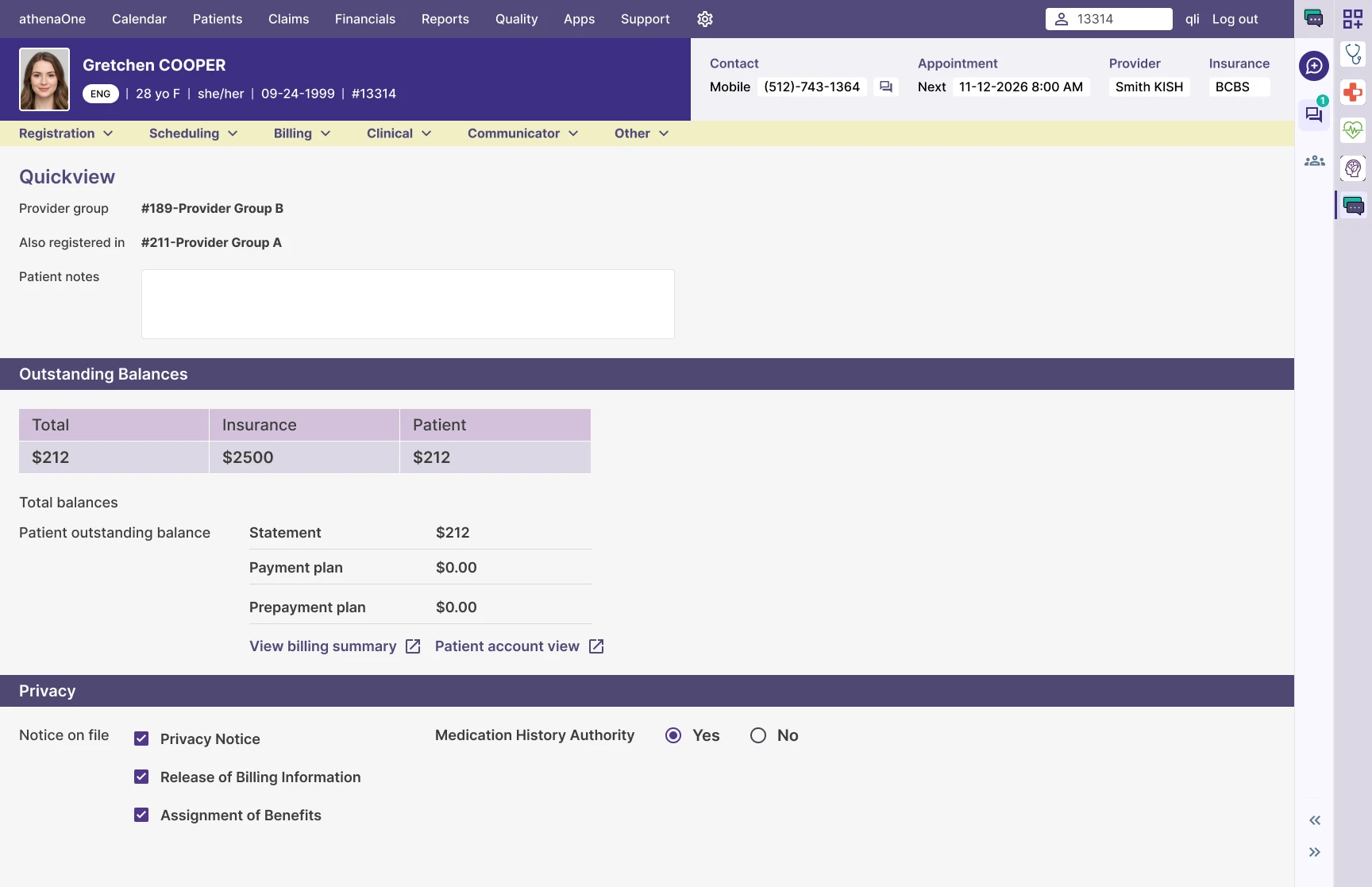
While mocking up the design, I realized I could push the idea further. The smallest size the framework supported was 50px, small enough to create a kind of docking state: the app window would technically still be open, but quiet enough that staff could fold it away when they weren’t actively using it, and still glance over when a new message came in.
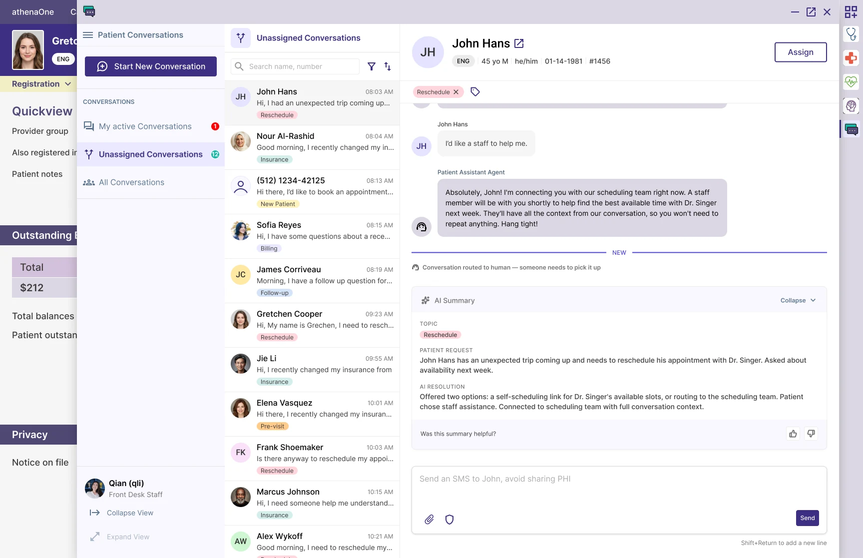
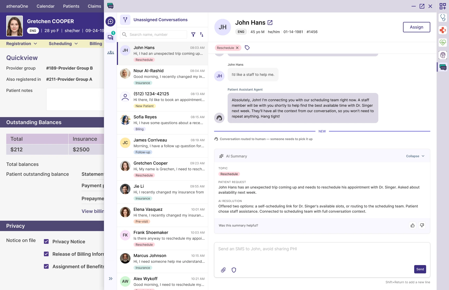
FIG. 07 — What shipped after we rebuilt it ourselves
Result
Patient Conversations ended up with three states:
- Collapsed at 50px, a quiet notification bar.
- Working view at 400px, for side-by-side use.
- Full view, for when staff needed the whole screen to focus on the conversation.
All three shipped with the v1 redesign. The badging gap was solved, and the 400px side-by-side view became one of the most-loved parts of the entire product across both alpha and beta.
The bigger picture
The three states don’t just fix a notification gap. They give us a usable pattern that makes the contextual entry points I envisioned back in discovery actually implementable.
Designing the invisible: what if they say no?
Context
V1 kept the AI agent narrow. It could answer basic questions like office hours, parking, insurance. Anything else routed to staff.
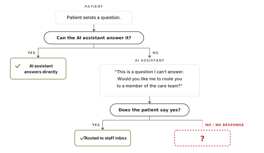
During internal testing, I asked it something outside its scope. It replied: “This is a question I can’t answer. Would you like me to route you to a member of the care team?”
What I overlooked
I tested what happened when the patient said yes. I never tested what happened when they said no.
At the time, I assumed the team had it covered. I never checked myself. I couldn’t judge whether that experience was safe, because I never saw what it actually looked like.
FIG. 08 — The path I overlooked: what happens when patients say no.
Going forward
No interface doesn’t mean no flow. When there’s no UI involved, it’s even more important to draw out the experience step by step. The experience doesn’t end when the UI does.
Closing words
After 8+ years in design, there’s something I’ve realized: the value a designer brings to a team is never just drawing the interface, especially in the age of AI. There’s no shortage of chat-tool patterns out there. The hard part is knowing what to build, given our users, timeline, and constraints. The harder part is knowing what not to build.
Sometimes that meant choosing what mattered most right now and letting the rest wait. It meant pushing back when the safe answer was “add more.” It meant defending a standard I didn’t control. And sometimes it meant designing the experience even when there was no interface to design.
This is the design half of the story. The other half, how we decided what to build first, what to cut, and the fight over pricing before GA, lives in the companion case study.